Person Reveals Why Popular Brands Are Changing Their Logos To Look Similar, Goes Viral On Twitter
Some brands have such a huge reputation that we instantly recognize not only the logo but also the font they use. Meanwhile, some logos are thoroughly enrapturing and stick in our minds because of how aesthetic they are. However, there’s a worrying trend that some have spotted: company logos are all starting to look pretty much the same. Standardized. Homogeneous. Readable? Definitely. But bland and (arguably) increasingly soulless.
Writer, podcast host, and educator David Perell explained what’s causing brand logos to look alike in a viral Twitter thread. The good news is that things are way clearer now than before. The bad news? This movement towards similarity can be noticed in other areas, too. And that’s a cause for concern. Scroll down to check out David’s analysis of what’s really going on and share your thoughts in the comments, dear Pandas. And if we’ve got any logo designers or graphic artists in here today, we’d love to get your opinions, too!
Bored Panda reached out to Matt Johnson, Ph.D., for a chat about why logos are starting to look so similar these days, and what the future might hold. Johnson is a consumer psychology specialist, the host of the Neuroscience of Branding blog, a professor at Hult International Business School and Harvard University, and the author of ‘Branding that Means Business: How to Build Enduring Bonds between Brands, Consumers and Markets.’ You’ll find our full interview with the expert below. Now, shall we?
More info: Twitter | Podcast 1 | Podcast 2 | WriteOfPassage.School | Perell.com
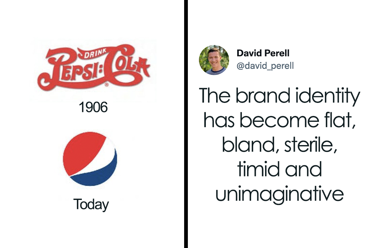
Writer David analyzed why so many things, including well-known company logos, are starting to look the same

Image credits: david_perell

Image credits: david_perell
This sort of design homogenization isn’t unique to just logos, though. It can be seen in pretty much every area in life

Image credits: david_perell

Image credits: david_perell

Image credits: david_perell

Image credits: david_perell

Image credits: david_perell
According to David, designs lose a bit of their soul when efficiency is prioritized above uniqueness

Image credits: david_perell

Image credits: david_perell
Even writers have fallen prey to the same trends and tend to write similarly

Image credits: david_perell

Image credits: david_perell

Image credits: JoyceCarolOates

Image credits: david_perell
Art is no exception, especially in the corporate world

Image credits: david_perell
Buildings are starting to look very similar, too, all over the world

Image credits: david_perell

Image credits: david_perell
Writer David’s thread draws some inspiration from the article published by Radek Sienkiewicz on VelvetShark. According to David, in a hyper-connected world, aesthetic diversity suffers. Especially when so many designers end up using the same tools.
The issue is that in a globalized world, this homogenization of design decisions starts to affect far more than brand logos. It spreads to architecture, furniture, even phone booths, doorbells, and street poles. When everything’s so data-driven, art, creativity, and the imagination all suffer.
When you know for a fact what fonts are the most readable by your customers online, you’re more likely to pick those instead of something truly unique. That is, if views, clicks, and profit are your primary goals. This sounds like an awful world to live in. But this design dystopia isn’t something straight out of fiction—it’s slowly spreading its tendrils here and now.
David argues that “when you strip away too much of the non-essential, you lose the kind of craftsmanship that endows an object with soul and makes life feel meaningful.” In other words, optimizing everything ends up carving away the essence of the brand and product.
That’s not to say that editing, iterating, and refining the design isn’t important—it’s vital—but at the end of the day you have to honestly evaluate whether all that efficiency is really worth it. Quality, real quality, can’t be quantified and tested by focus groups. And bold, unique aesthetic decisions are a huge part of that. Really, who’d prefer to live in a world of spiritually grey, unassuming corporate logos? Where’s the energy, the mojo, the pizzazz?
“Writers aren’t immune to these trends. It seems like every non-fiction book follows the same blueprint of simple words, short sentences, and research papers to justify every obvious intuition,” David says that the reach of homogenization really is that widespread. Pretty much nobody’s safe! Corporate artists included.
David hopes to teach “thousands of people” to write online and teaches an online course called ‘Write of Passage’ (we love the pun). He also hosts two podcasts, the ‘Write of Passage Podcast,’ as well as the ‘North Star Podcast.’ The latter is a collection of interviews with high-performing, successful individuals.
Twitter users had their own theories about why logos are starting to look so similar

Image credits: CharlieQuirk

Image credits: VlTO__
Professor Johnson, from Hult International Business School and Harvard University, told Bored Panda that there are a few reasons behind the trend of logo homogenization. “The first is that as we move towards a more digital environment, there’s a need to make brand logos as legible and as easy to identify as possible. The consumer’s attention is strained even more in the online world, so logos can’t afford to be disfluent or challenging to process,” he said.
“Secondly, there also may be a growing realization of the ‘fluency effect’: the relatively robust behavioral science phenomenon that the more fluent a font is written in, the more likable and trustworthy the message. As more brands become familiar with this phenomenon, they may want to test new, more fluently written logos to capitalize on this effect.”
According to the consumer psychology specialist, the brand and, by extension, the brand logo, is driven by the need to differentiate. However, it doesn’t necessarily need to differentiate itself from all other brands, only from its most immediate competitors within the same industry, at a similar price point.
“So while this logo trend is seen across a wide array of industries, there may be only one or two within each industry that may make this change, since if everyone did, they would not be differentiating as well. There may be a broader implication of this: if companies begin to recognize that consumers, at least in digital environments, prefer more basic logo designs, brands will rush to be the first in their industry to do so to plant their flag first. While all brands want to be at the razor’s edge of consumer preferences, no brand wants to be seen as the copycat of their competitor,” the professor explained to Bored Panda.
“It’s also worth pointing out that brands can, and do have multiple trademarked logos which they own. So while new logos may pop up for storied brands like Coca-Cola, Google, and Burberry, these may not all be replacements but ‘alternatives’ that are being tested for these new consumer environments,” he said that what we see might be an experiment of sorts to test the waters and see how people react.
Bored Panda asked Professor Johnson about what predictions he’d make about the future, and whether this trend of logo homogenization is here to stay. We were also curious about how consumers might respond if more companies end up using increasingly similar logos.
“I imagine the general trend will persist, especially in the digital environment. If it turns out to be the case that more basic, legible logos are more suitable for online preferences, we may also move to a system where each major brand has at least two distinct brand logos: one in the digital world, and one for the physical world. This is already happening to a certain extent since many brands that have gone to a more basic font haven’t completely jettisoned their originals and retained them for specific uses,” the author of ‘Branding that Means Business’ shared with us.
“Since branding is fundamentally about differentiation, there will be an upper limit to how much brand logos can homogenize and go together on a single dimension. It’s great to adapt to new consumer preferences, but if every brand does that in the same way, it fails to differentiate in a significant way. This is why I think there is a ‘race’ within each industry to be the first to do so, which then makes things more difficult for their competitors: should they persist in making their logo more basic, at the risk of looking like a copycat? Or should they cede that positioning and devise a way to differentiate by some other means?” the consumer psychology specialist revealed the dilemma that companies face.
According to the expert, brands might need to get creative if it turns out to be the case that consumers want more fluent, legible processing for online environments. “Not everyone can be first in their industry and do this in a way that enhances their differentiation. Thankfully, brands have other identifiers that can express their personality and separate themselves from consumers,” the professor said.
“For example, brands may double down on fluent soundmarks, tighter taglines, or speaking product features that are trademarked and exclusive. In this way, we may see a much richer adaptation to the online world, which goes above and beyond the legibility of brand logos,” Professor Johnson noted that there’s a wide variety of ways to leave a lasting impact on the consumer. Logos are just the tip of the iceberg.
Here’s what some people said on the topic. While some hate the new trend, others actually like it

Image credits: ZubyMusic

Image credits: sterespect

Image credits: PW_Arts

Image credits: andretaris

Image credits: NickHintonn

Image credits: MelanieGravel

Image credits: vcoparis

Image credits: robinzharley

Image credits: ConsciousBuddah

Image credits: arvalis

Image credits: AbzJHarding

Image credits: Yezz007

Image credits: bitemini

Image credits: PezBananaNFT

Image credits: Alstro56


So... everyone is buying the Billy bookcase because there are no beautiful, old, wood & glass ones available? Trust me, I know where to buy those, I just can't afford them.
The bookshelf example actually pissed me off a little bit, tbh. I mean I'm sorry, the reason for designing slimmer and sleeker furniture is clearly not lack of style, but lack of space! People nowadays live in small apartements and need slim furniture to make the best of the space available. Good luck fitting a massive, roundish, non-demountable monstrosity as shown in OP's example into a city dwelling.
Load More Replies...I actually have a theory about this. There have been studies that link times of stress (mostly financial) inversely with the complication level of favorite songs. Basically, the more stressed a group is, the more they prefer simple and repetitive music. My guess is that can apply to other forms of media and art. The other possibility is that no one really writes by hand anymore which means that artistic fonts are being used less because to the average non-cursive user, they are difficult to read.
Yes, more difficult to read - therefore not accessible. As mentioned in the post above, most organisations want their content to pass basic accessibility rules (not sure if it's enshrined in law? But wouldn't be surprised if so).
Load More Replies...The accessibility issue many brought up is very important. People need to be able to read and understand them, not just look at them and say " oh it's beautiful, but what's written there?". Brands are global nowadays. They need to reach to countless cultures and languages, not just the culture and language of the country its based in. And what was that bookcase comparison? The old wood and glass bookcase is extremely heavy and hard to move without damage. In contrast, the white bookcase in the example is comparatively lighter, and from what I can see, most likely is detachable. These are for people's convenience, not just for the looks.
I'm dyslexic. I still prefer the creative font, and people learned to recognize them by their distinctiveness. One thing the 'inclusiveness' conversation is leaving out are the vast numbers of people who can't read, or can't read English, in which a great number of worldwide goods are labeled. Distinctive labels aid in recognition, they don't hinder it. We aren't saying write The Whole Label in fancy font, but logos are just that - representative word art.
Load More Replies...So... everyone is buying the Billy bookcase because there are no beautiful, old, wood & glass ones available? Trust me, I know where to buy those, I just can't afford them.
The bookshelf example actually pissed me off a little bit, tbh. I mean I'm sorry, the reason for designing slimmer and sleeker furniture is clearly not lack of style, but lack of space! People nowadays live in small apartements and need slim furniture to make the best of the space available. Good luck fitting a massive, roundish, non-demountable monstrosity as shown in OP's example into a city dwelling.
Load More Replies...I actually have a theory about this. There have been studies that link times of stress (mostly financial) inversely with the complication level of favorite songs. Basically, the more stressed a group is, the more they prefer simple and repetitive music. My guess is that can apply to other forms of media and art. The other possibility is that no one really writes by hand anymore which means that artistic fonts are being used less because to the average non-cursive user, they are difficult to read.
Yes, more difficult to read - therefore not accessible. As mentioned in the post above, most organisations want their content to pass basic accessibility rules (not sure if it's enshrined in law? But wouldn't be surprised if so).
Load More Replies...The accessibility issue many brought up is very important. People need to be able to read and understand them, not just look at them and say " oh it's beautiful, but what's written there?". Brands are global nowadays. They need to reach to countless cultures and languages, not just the culture and language of the country its based in. And what was that bookcase comparison? The old wood and glass bookcase is extremely heavy and hard to move without damage. In contrast, the white bookcase in the example is comparatively lighter, and from what I can see, most likely is detachable. These are for people's convenience, not just for the looks.
I'm dyslexic. I still prefer the creative font, and people learned to recognize them by their distinctiveness. One thing the 'inclusiveness' conversation is leaving out are the vast numbers of people who can't read, or can't read English, in which a great number of worldwide goods are labeled. Distinctive labels aid in recognition, they don't hinder it. We aren't saying write The Whole Label in fancy font, but logos are just that - representative word art.
Load More Replies...
195
99