Person Reveals Why Popular Brands Are Changing Their Logos To Look Similar, Goes Viral On Twitter
Some brands have such a huge reputation that we instantly recognize not only the logo but also the font they use. Meanwhile, some logos are thoroughly enrapturing and stick in our minds because of how aesthetic they are. However, there’s a worrying trend that some have spotted: company logos are all starting to look pretty much the same. Standardized. Homogeneous. Readable? Definitely. But bland and (arguably) increasingly soulless.
Writer, podcast host, and educator David Perell explained what’s causing brand logos to look alike in a viral Twitter thread. The good news is that things are way clearer now than before. The bad news? This movement towards similarity can be noticed in other areas, too. And that’s a cause for concern. Scroll down to check out David’s analysis of what’s really going on and share your thoughts in the comments, dear Pandas. And if we’ve got any logo designers or graphic artists in here today, we’d love to get your opinions, too!
Bored Panda reached out to Matt Johnson, Ph.D., for a chat about why logos are starting to look so similar these days, and what the future might hold. Johnson is a consumer psychology specialist, the host of the Neuroscience of Branding blog, a professor at Hult International Business School and Harvard University, and the author of ‘Branding that Means Business: How to Build Enduring Bonds between Brands, Consumers and Markets.’ You’ll find our full interview with the expert below. Now, shall we?
More info: Twitter | Podcast 1 | Podcast 2 | WriteOfPassage.School | Perell.com
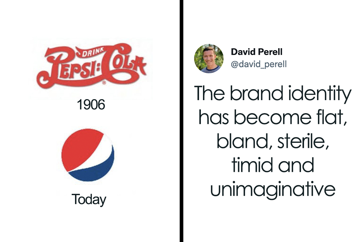
Writer David analyzed why so many things, including well-known company logos, are starting to look the same

Image credits: david_perell

Image credits: david_perell
This sort of design homogenization isn’t unique to just logos, though. It can be seen in pretty much every area in life

Image credits: david_perell

Image credits: david_perell

Image credits: david_perell

Image credits: david_perell

Image credits: david_perell
According to David, designs lose a bit of their soul when efficiency is prioritized above uniqueness

Image credits: david_perell

Image credits: david_perell
Even writers have fallen prey to the same trends and tend to write similarly

Image credits: david_perell

Image credits: david_perell

Image credits: JoyceCarolOates

Image credits: david_perell
Art is no exception, especially in the corporate world

Image credits: david_perell
Buildings are starting to look very similar, too, all over the world

Image credits: david_perell

Image credits: david_perell
Writer David’s thread draws some inspiration from the article published by Radek Sienkiewicz on VelvetShark. According to David, in a hyper-connected world, aesthetic diversity suffers. Especially when so many designers end up using the same tools.
The issue is that in a globalized world, this homogenization of design decisions starts to affect far more than brand logos. It spreads to architecture, furniture, even phone booths, doorbells, and street poles. When everything’s so data-driven, art, creativity, and the imagination all suffer.
When you know for a fact what fonts are the most readable by your customers online, you’re more likely to pick those instead of something truly unique. That is, if views, clicks, and profit are your primary goals. This sounds like an awful world to live in. But this design dystopia isn’t something straight out of fiction—it’s slowly spreading its tendrils here and now.
David argues that “when you strip away too much of the non-essential, you lose the kind of craftsmanship that endows an object with soul and makes life feel meaningful.” In other words, optimizing everything ends up carving away the essence of the brand and product.
That’s not to say that editing, iterating, and refining the design isn’t important—it’s vital—but at the end of the day you have to honestly evaluate whether all that efficiency is really worth it. Quality, real quality, can’t be quantified and tested by focus groups. And bold, unique aesthetic decisions are a huge part of that. Really, who’d prefer to live in a world of spiritually grey, unassuming corporate logos? Where’s the energy, the mojo, the pizzazz?
“Writers aren’t immune to these trends. It seems like every non-fiction book follows the same blueprint of simple words, short sentences, and research papers to justify every obvious intuition,” David says that the reach of homogenization really is that widespread. Pretty much nobody’s safe! Corporate artists included.
David hopes to teach “thousands of people” to write online and teaches an online course called ‘Write of Passage’ (we love the pun). He also hosts two podcasts, the ‘Write of Passage Podcast,’ as well as the ‘North Star Podcast.’ The latter is a collection of interviews with high-performing, successful individuals.
Twitter users had their own theories about why logos are starting to look so similar

Image credits: CharlieQuirk

Image credits: VlTO__
Professor Johnson, from Hult International Business School and Harvard University, told Bored Panda that there are a few reasons behind the trend of logo homogenization. “The first is that as we move towards a more digital environment, there’s a need to make brand logos as legible and as easy to identify as possible. The consumer’s attention is strained even more in the online world, so logos can’t afford to be disfluent or challenging to process,” he said.
“Secondly, there also may be a growing realization of the ‘fluency effect’: the relatively robust behavioral science phenomenon that the more fluent a font is written in, the more likable and trustworthy the message. As more brands become familiar with this phenomenon, they may want to test new, more fluently written logos to capitalize on this effect.”
According to the consumer psychology specialist, the brand and, by extension, the brand logo, is driven by the need to differentiate. However, it doesn’t necessarily need to differentiate itself from all other brands, only from its most immediate competitors within the same industry, at a similar price point.
“So while this logo trend is seen across a wide array of industries, there may be only one or two within each industry that may make this change, since if everyone did, they would not be differentiating as well. There may be a broader implication of this: if companies begin to recognize that consumers, at least in digital environments, prefer more basic logo designs, brands will rush to be the first in their industry to do so to plant their flag first. While all brands want to be at the razor’s edge of consumer preferences, no brand wants to be seen as the copycat of their competitor,” the professor explained to Bored Panda.
“It’s also worth pointing out that brands can, and do have multiple trademarked logos which they own. So while new logos may pop up for storied brands like Coca-Cola, Google, and Burberry, these may not all be replacements but ‘alternatives’ that are being tested for these new consumer environments,” he said that what we see might be an experiment of sorts to test the waters and see how people react.
Bored Panda asked Professor Johnson about what predictions he’d make about the future, and whether this trend of logo homogenization is here to stay. We were also curious about how consumers might respond if more companies end up using increasingly similar logos.
“I imagine the general trend will persist, especially in the digital environment. If it turns out to be the case that more basic, legible logos are more suitable for online preferences, we may also move to a system where each major brand has at least two distinct brand logos: one in the digital world, and one for the physical world. This is already happening to a certain extent since many brands that have gone to a more basic font haven’t completely jettisoned their originals and retained them for specific uses,” the author of ‘Branding that Means Business’ shared with us.
“Since branding is fundamentally about differentiation, there will be an upper limit to how much brand logos can homogenize and go together on a single dimension. It’s great to adapt to new consumer preferences, but if every brand does that in the same way, it fails to differentiate in a significant way. This is why I think there is a ‘race’ within each industry to be the first to do so, which then makes things more difficult for their competitors: should they persist in making their logo more basic, at the risk of looking like a copycat? Or should they cede that positioning and devise a way to differentiate by some other means?” the consumer psychology specialist revealed the dilemma that companies face.
According to the expert, brands might need to get creative if it turns out to be the case that consumers want more fluent, legible processing for online environments. “Not everyone can be first in their industry and do this in a way that enhances their differentiation. Thankfully, brands have other identifiers that can express their personality and separate themselves from consumers,” the professor said.
“For example, brands may double down on fluent soundmarks, tighter taglines, or speaking product features that are trademarked and exclusive. In this way, we may see a much richer adaptation to the online world, which goes above and beyond the legibility of brand logos,” Professor Johnson noted that there’s a wide variety of ways to leave a lasting impact on the consumer. Logos are just the tip of the iceberg.
Here’s what some people said on the topic. While some hate the new trend, others actually like it

Image credits: ZubyMusic

Image credits: sterespect

Image credits: PW_Arts

Image credits: andretaris

Image credits: NickHintonn

Image credits: MelanieGravel

Image credits: vcoparis

Image credits: robinzharley

Image credits: ConsciousBuddah

Image credits: arvalis

Image credits: AbzJHarding

Image credits: Yezz007

Image credits: bitemini

Image credits: PezBananaNFT

Image credits: Alstro56


So... everyone is buying the Billy bookcase because there are no beautiful, old, wood & glass ones available? Trust me, I know where to buy those, I just can't afford them.
The bookshelf example actually pissed me off a little bit, tbh. I mean I'm sorry, the reason for designing slimmer and sleeker furniture is clearly not lack of style, but lack of space! People nowadays live in small apartements and need slim furniture to make the best of the space available. Good luck fitting a massive, roundish, non-demountable monstrosity as shown in OP's example into a city dwelling.
Load More Replies...I actually have a theory about this. There have been studies that link times of stress (mostly financial) inversely with the complication level of favorite songs. Basically, the more stressed a group is, the more they prefer simple and repetitive music. My guess is that can apply to other forms of media and art. The other possibility is that no one really writes by hand anymore which means that artistic fonts are being used less because to the average non-cursive user, they are difficult to read.
Yes, more difficult to read - therefore not accessible. As mentioned in the post above, most organisations want their content to pass basic accessibility rules (not sure if it's enshrined in law? But wouldn't be surprised if so).
Load More Replies...The accessibility issue many brought up is very important. People need to be able to read and understand them, not just look at them and say " oh it's beautiful, but what's written there?". Brands are global nowadays. They need to reach to countless cultures and languages, not just the culture and language of the country its based in. And what was that bookcase comparison? The old wood and glass bookcase is extremely heavy and hard to move without damage. In contrast, the white bookcase in the example is comparatively lighter, and from what I can see, most likely is detachable. These are for people's convenience, not just for the looks.
I'm dyslexic. I still prefer the creative font, and people learned to recognize them by their distinctiveness. One thing the 'inclusiveness' conversation is leaving out are the vast numbers of people who can't read, or can't read English, in which a great number of worldwide goods are labeled. Distinctive labels aid in recognition, they don't hinder it. We aren't saying write The Whole Label in fancy font, but logos are just that - representative word art.
Load More Replies...I feel like everyone in those tweets are overthinking it. What it comes down to is money. For the logos, it's cheaper to just use a font that is available on any PC. Its also easier/cheaper to have just a logo that is accessible in ANY country, not just ones that speak english or use english letters. One logo design globally instead of one for each country/region. For the doorbells and phone booths etc Its cheaper to have a design that is easily made by simple factory techniques such as molding a flat object, or cutting a cylinder, as opposed to laser cutting a complicated pattern. For the buildings its cheaper to manufacture a kit made from all the same flat parts. Cheaper to manufacture, quicker (and therefore cheaper) to construct. For the bookcases, it's cheaper and faster to just make fibre wood and cut it into planks, over the craftsmanship needed for an antique style bookcase. Cheaper for the end client too.
Exactly, I also think it just comes down to money and time saving rather than anything else. Billions of new customers have been added to the market in this time frame.
Load More Replies...Did they, though? I saw an article a while ago about an initiative by young architects to "restore beauty", or smth like that. They had done a bit of research and apparently people want to see more decorative architecture and architects want to draw more decorative architecture. The problem is money.
Load More Replies...Another aspect of design periods throughout history is when new styles were developed in reaction/rebellion to the current. For example, look at the The International Typographic Style. Everything was super clean, typographical (hello Helvetica), used photography and was about being functional. The era of art in contrast around that time was the print advertisements (I’m blanking on the name of that era) that feature hand drawn elements, loud display typography etc. I even notice currently, that we’re finally stepping away from minimalism and going into more display fonts and experimental design which is exciting! (though none of these corporate logos in this article show that). Just another element to consider in addition to what was mentioned in this article, design is not made in a vacuum.
Having over 30 years experience in the graphic design/publishing business as an art director, I can tell you that it’s not a lack of creativity, it’s a lack of imagination on the part of the client. The bottom line message in any meeting about the “look” of something is ‘just make it look like (fill in the blank). ‘ They don’t want to hear or see anything innovative, they just want what the know sells for someone else.
It's quite simple: accessibility, small screens (less pixels to fit an intricate design into), craft vs mass production (furniture), and just general style preference over the years. When the world started making those (now) beautiful phone booths and poles, Arts and Crafts movement were shouting that they are horrible, because they were mass produced. When the Eiffel tower was built, Parisians hated it, but now it's iconic. Times change, this too shall pass.
Exactly. There's nothing mysterious about all of this.
Load More Replies...Uhm ... style, anyone? Are we all wearing top hats, puffy dresses and riding on horses? Times change. They will change again. This thread reads like "when I was your age, son, music was actual MUSIC ..." Relax.
I think the biggest two reasons are accessibility and scale. The Pepsi logo needs to be as easily identifiable as a tiny icon on an apple watch or android phone app ordering ubereats as a billboard 1000 yards away. A logo needs to be read as easily by a person with cataracts as someone who is dyslexic or colorblind or has 20/20 vision. When you were one of 20 tailors on Savile Road, a unique font was a way to get a Victorian gentleman to walk in your door. Now most of your business is online and it needs to be easily identified on both a Japanese website and Spanish YouTube commercial.
I always thought that the point with logos was that you don't have to be able to read what it says, if it's a good logo it is unique and instantly recognisable anyway? I remember a cruiseline here in Sweden, Silja Line, did a thing back in the day and cut of most of their logo so it just said "lja lin" but people still knew it was their logo because it was so recogniseable.
This is one of the most useless observations I've ever seen. The reason brand logos look the same is because no one cares about branding. It just has to be distinct enough for people to recognize. The reason they other things are simply designed is because that's less expensive to mass produce. Nobody wants to pay $1000 more for a pretty doorbell camera. They want one that's affordable and effective. Beyond that this observation doesn't hold up. Plenty of furniture makers still make beautiful one of a kind pieces. Art is still unique and beautiful. Artists are still creative and finding new ways to use all sorts of tools to create art. This guy is a whiny idiot who can't find anything useful to do, so he's just looking for nonsense to complain about.
Agreed. Also, I would argue that he's comparing typefaces, not logos. If I see a white "f" on a blue background I will know it's Facebook, no matter what font the "f" is in. Same for Google and others on that list. But there will always be people who complain that the world used to be so much better way back when (spoiler alert: it wasn't).
Load More Replies...Those "modern" houses you see are kits you can buy online. Austin has been taken over by them in the older neighborhoods.
Sears had house kits a hundred years ago, but the houses were pretty nice, and many are still standing.
Load More Replies...He's not "revealing" anything - it's a series of guesses that he posted on twitter.
They reason it all looks the same is because everyone is looking for a reason to be offended these days. So now the logos are all boring and uniform, trying to get their name out there, but still keeping a low profile. Now people are complaining that they're boring. You can't win.
I got only one thing to say: Aesthetics/beauty is so much more than ornamentation. If a minimalist design (of anything) is "flat/bland/sterile/timid/unimaginitive" and not "pleasant/joyous/inviting" you can be sure that it is becasue it is NOT well-designed.
I don't know about other aspects of this post but with regards to fonts and logos, the main consideration right now in designing them is whether they are readable and recognizable in any screen size whether mobile, laptop, or PC thus the major changes. Of course, minimalism has influenced this greatly, also
Another one of these ridiculous articles. They could have easily argued that the Pepsi logo used to look very similar to the Coca Cola one but now it's distinct and has its own personality. Instead they claim it looks flat and it was better when it looked like Coca Cola. But when other logos used to look different (they come from different eras with different styles) but now they look similar, that's also bad. The premise of this article is: old logos=good, new logos=bad so the author does everything in his power to prove this, even if it envolves cherrypicking and having self-contradictory standards for what is good and what is bad.
That's not what the article is about. It's the use of the same font, the lack of art (art departments in say marketing) and the homogenization of the logo's /fonts and even the articles these companies sell. There's no originality and no standing out. What surprises me is that even the artistic companies like designer clothing does this as well. I would expect them to know better but then again, I can't afford their sh!t so I never really paid attention.
Load More Replies...I've noticed a similar thing in music, particularly in metal. Everything just kinda sounds flat and cliche now. Maybe part of it is me getting older, but when I hear an album that came out 20 years ago for the first time, it's still new to me. Everything now has the same drum sound, the same guitar tone, riffs and solos are all pretty similar. No one's doing weird or out there stuff.
Personally, I think the changes are extremely boring and lack any imagination. There is nothing about them that makes the company name memorable. I don't think it will last.
I think part of this is an illusion brought about by 'age compression', by which I mean that periods of time in the past seem shorter because they are less significant to us. So for example, we tend to think of 'the 19th Century' as one period of time with a given aesthetic, and also 'the 1970s'. But of course a lot of things changed in the 9th century, because it was 100 years. And even 'the 1970s' wasn't really one aesthetic, it was 10 years. We wouldn't think of something 10 years old as representative of 'now'. And since designs change over time, there are obviously more variety of designs in a decade than in a year.
Coupled with this, people are generally not keeping their stuff as long. For example, if I buy a car of the same model as my neighbour, but his is twenty years old, they ill look quite different. If my city has houses that are 100 and 200 years old alongside new ones, there will be architectural variety. But most people nowadays don't keep their car 20 years, and because of population growth most people live in newer neighbourhoods with no old houses. The extreme of course is software, because when they update the logo it updates automatically everywhere, so you will never see the ten-year-old Spotify logo next to the new one.
Load More Replies...Or, and hear me out, styles are changing, and that doesn't signify decay.
As a designer myself, I can kind of understand this for the online platform. Take things like Figma for example. The whole idea is to be able to get layouts done quickly and as simply as possible with the intent of having the best UX possible. UX online vs UX in real life are two completely different beasts. So long as we don't lose that beauty from the print world, we're good. But then again, we're starting to see these kind of IG designs in real life too so I dunno...maybe just a phase and when we finally get VR, we won't worry so much? eh!
Blame it on linked media and globalization but - in my opinion it depends on consenting decisions. Out Brand needs to find audiences all over the word. Do a research. Ah. Sans serif is not botjering anyone. Let's do it. We need to sell.products all over the world. Make a Gaussian middle design so everyone is ok with it. Plus: deciders are swarms not experts
I hate this trend with a burning passion. My iPhone used to have beautiful 3D icons with drop shadows and a varied palette while being obviously representational. Now, they're flat, almost all the same shade of blue, and I can't tell one from the other. Extrapolate this to every single creative art: music, architecture, furniture, fashion, etc. This trend is soul-killing.
Not saying there's nothing to this complaint, but it's mostly dumb and presumptuous. I'll address points individually. **1** The most important thing to remember is that you're talking about CORPORATE BRAND LOGOS. If you're looking for creativity and soul in a corporate brand logo, that's pretty dumb, and you've already been suckered into their trap of making you think that they're anything more than a corporation that's trying to take your money. They have never cared about anything more than that, and looking for "personality" in their logo is fundamentally stupid, even if they have gotten blander in the past few years. **2** Many have said this so I'll keep it short, in the age of mobile internet, you need something that is legible at small and large fonts. Sans serif fonts does this better than everything else.
This is really interesting, something I haven't noticed. Now I feel like I'm going to be looking for this everywhere I go.
Or someone in france decided they want to reduce the font types... bra.png 
If people still had servants to do all the cleaning, then ornamentation (ie Victorian) would still be a thing
I know that in my town, the city council needed to buy some new street lights for the historical district. They proposed buying some nice, decorative lamps that were admittedly a little pricey. Cue the local, vocal minority who actually care about this stuff, and some truly hideous lamps were installed. Total savings? About fourty grand, about a buck per resident. But, by God we don't spend one extra penny for aesthetics.
Two other critical factors: cost and global reach. For example, PepsiCo's latest logo doesn't have letters in it. It's now a usable logo no matter the native written language. (It was anyway, lol.)
I can't speak for fonts and graphics, but when it comes to physical items like home design and manufacturing, the driving factor there is cost. Profit is King above all else. We could easily make decorative items like we did back in the 1900's or earlier, but they'd take more time and more skilled workers to make, and that means higher costs. This is especially noticeable in modern home design, or "minimalist" as they like to call it. "Open" designs, bannister-less stairs, no patios, etc. Those are all passed off as "design aesthetics" but in reality are just cost-saving mechanisms. Same thing with the new trend of "micro" or "Eco" apartments. It's all just to lower costs and maximize profits. Personality be damned, Profit is King.
What's interesting to me is that design has moved toward minimalistic and ultra minimalistic over the last few years, yet at the same time people are fighting to get the "handmade" feel. Handdrawn fonts, paintings on physical canvases and papers. Something that IS or seems tangible, but still isn't super ornate.
I remember reading somewhere that brands where being forced to make simple designs as we shop with our eyes so we are buying the brand not the product, it said it was to help smaller brands grow.
I would not compare logos to physical world products and draw conclusions. Products are often streamlined to allow more efficient manufacturing processes & constructions and make these cheaper.
And yet, Death Metal went in the opposite direction: https://worleygig.com/2008/11/23/death-metal-band-logos/ D24458D6-7...25cc42.gif 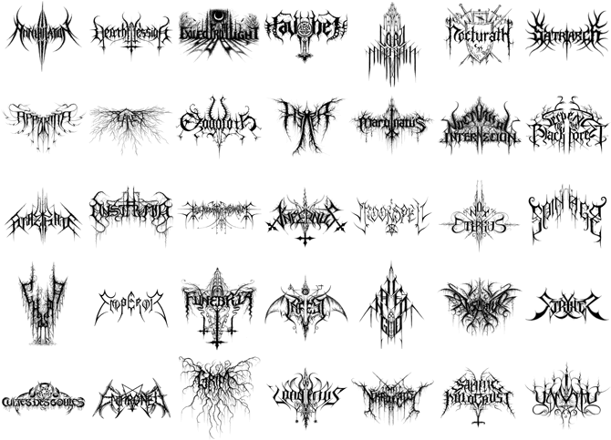
Music. I can't stand radio for 20 years now. It's all the same stuff, the same beat, same easy-to-digest c**p. All... simplified, if it is easy to crank up the volume, here is your homogeneous stuff to act like another sheep in their game...
Money. That’s all. The plain logos on clothes are easier to print on the tags (perhaps less ink is being used?), easier to put\ utilize on all kinds of electronic screens, and easiest to just know a name quickly if you aren’t familiar with a brand or it’s logo. The example of Pepsi also just comes down to sales I would imagine. If the sales are increased or are steady with a simple logo they’ll do it. Furniture, houses - as long as people are buying the cookie cutter stuff they’ll keep making the supplies for them. Same thing with books. As long as people keep buying them, they’ll keep making them with that formula. It’s not the companies or writers, it’s us. And I think we like it that way because #1 we really can’t afford unique or hand crafted items anymore - the prices charged for them is out of reach for most people and #2 we aren’t the best at accepting change.
I'm dyslexic. I still prefer the creative font, and people learned to recognize them by their distinctiveness. One thing the 'inclusiveness' conversation is leaving out are the vast numbers of people who can't read, or can't read English, in which a great number of worldwide goods are labeled. Distinctive labels aid in recognition, they don't hinder it. We aren't saying write The Whole Label in fancy font, but logos are just that - representative word art.
I noticed 2 decades ago that options were diminishing, and variations were less distinct. It wasn't just the internet, it's the fact we've concentrated into a few mega conglomerates, and offshored the majority of manufacturing to a few vendors. Thousands of worldwide makers used to supply each category of good, now it's frequently down to hundreds, dozens, or fewer. This is also contributing to supply chain issues. When one supplier falls behind, there are no others with the capacity (Bare bones operation!) to step up. We have sacrificed everything in the name of profits for 1% of the population. But hey, unfettered capitalism is great, right?
What's up with all the phone booth mentions? Those aren't being homogenized, they're practically extinct besides in England. Btw good article/analysis of modern design asthetics. Inevitably everything becomes white-washed for the sake of simplicity. True craftsmanship and unique design languages are of the past.
Just seeing logos and brands with unique fonts make them instantly recognizable that you don't have to actually read the words to know who they are. These days they are no longer appreciated, as most of us, especially the younger generations spend most of their time online, and really do not understand how beautiful these logos are. They are all for easily readable, which is a reflection of the culture now- Instant-gratification and dislike for traditions.
Music too. Example: Love songs. They used to be sweet and kind, now they’re just talking about appearance and beauty standards.
I was thinking about comic strips. Even though Peanuts is simple, the drawing is very skillful. Just look at a picture of good old Charlie Brown striking out. Then compare that to the barely competent drawing in Dilbert. Now a lot of people who draw circles for heads and little better than stick figures are cartoonists. How many do you see like Calvin and Hobbes? I know there are good cartoonists out there and welcome invitations.
Maybe cursive being taken out of the curriculum has something to do with it? The younger generations don't want fonts that they can't read.
Alot of pissing and moaning ..oh where has art gone...oh the funding.....sad lot you are. Who among you is actively creating? Excuses. Your pitiful whining is contributing to the problem. Shove a paintbrush in it and get creative!
So... everyone is buying the Billy bookcase because there are no beautiful, old, wood & glass ones available? Trust me, I know where to buy those, I just can't afford them.
The bookshelf example actually pissed me off a little bit, tbh. I mean I'm sorry, the reason for designing slimmer and sleeker furniture is clearly not lack of style, but lack of space! People nowadays live in small apartements and need slim furniture to make the best of the space available. Good luck fitting a massive, roundish, non-demountable monstrosity as shown in OP's example into a city dwelling.
Load More Replies...I actually have a theory about this. There have been studies that link times of stress (mostly financial) inversely with the complication level of favorite songs. Basically, the more stressed a group is, the more they prefer simple and repetitive music. My guess is that can apply to other forms of media and art. The other possibility is that no one really writes by hand anymore which means that artistic fonts are being used less because to the average non-cursive user, they are difficult to read.
Yes, more difficult to read - therefore not accessible. As mentioned in the post above, most organisations want their content to pass basic accessibility rules (not sure if it's enshrined in law? But wouldn't be surprised if so).
Load More Replies...The accessibility issue many brought up is very important. People need to be able to read and understand them, not just look at them and say " oh it's beautiful, but what's written there?". Brands are global nowadays. They need to reach to countless cultures and languages, not just the culture and language of the country its based in. And what was that bookcase comparison? The old wood and glass bookcase is extremely heavy and hard to move without damage. In contrast, the white bookcase in the example is comparatively lighter, and from what I can see, most likely is detachable. These are for people's convenience, not just for the looks.
I'm dyslexic. I still prefer the creative font, and people learned to recognize them by their distinctiveness. One thing the 'inclusiveness' conversation is leaving out are the vast numbers of people who can't read, or can't read English, in which a great number of worldwide goods are labeled. Distinctive labels aid in recognition, they don't hinder it. We aren't saying write The Whole Label in fancy font, but logos are just that - representative word art.
Load More Replies...I feel like everyone in those tweets are overthinking it. What it comes down to is money. For the logos, it's cheaper to just use a font that is available on any PC. Its also easier/cheaper to have just a logo that is accessible in ANY country, not just ones that speak english or use english letters. One logo design globally instead of one for each country/region. For the doorbells and phone booths etc Its cheaper to have a design that is easily made by simple factory techniques such as molding a flat object, or cutting a cylinder, as opposed to laser cutting a complicated pattern. For the buildings its cheaper to manufacture a kit made from all the same flat parts. Cheaper to manufacture, quicker (and therefore cheaper) to construct. For the bookcases, it's cheaper and faster to just make fibre wood and cut it into planks, over the craftsmanship needed for an antique style bookcase. Cheaper for the end client too.
Exactly, I also think it just comes down to money and time saving rather than anything else. Billions of new customers have been added to the market in this time frame.
Load More Replies...Did they, though? I saw an article a while ago about an initiative by young architects to "restore beauty", or smth like that. They had done a bit of research and apparently people want to see more decorative architecture and architects want to draw more decorative architecture. The problem is money.
Load More Replies...Another aspect of design periods throughout history is when new styles were developed in reaction/rebellion to the current. For example, look at the The International Typographic Style. Everything was super clean, typographical (hello Helvetica), used photography and was about being functional. The era of art in contrast around that time was the print advertisements (I’m blanking on the name of that era) that feature hand drawn elements, loud display typography etc. I even notice currently, that we’re finally stepping away from minimalism and going into more display fonts and experimental design which is exciting! (though none of these corporate logos in this article show that). Just another element to consider in addition to what was mentioned in this article, design is not made in a vacuum.
Having over 30 years experience in the graphic design/publishing business as an art director, I can tell you that it’s not a lack of creativity, it’s a lack of imagination on the part of the client. The bottom line message in any meeting about the “look” of something is ‘just make it look like (fill in the blank). ‘ They don’t want to hear or see anything innovative, they just want what the know sells for someone else.
It's quite simple: accessibility, small screens (less pixels to fit an intricate design into), craft vs mass production (furniture), and just general style preference over the years. When the world started making those (now) beautiful phone booths and poles, Arts and Crafts movement were shouting that they are horrible, because they were mass produced. When the Eiffel tower was built, Parisians hated it, but now it's iconic. Times change, this too shall pass.
Exactly. There's nothing mysterious about all of this.
Load More Replies...Uhm ... style, anyone? Are we all wearing top hats, puffy dresses and riding on horses? Times change. They will change again. This thread reads like "when I was your age, son, music was actual MUSIC ..." Relax.
I think the biggest two reasons are accessibility and scale. The Pepsi logo needs to be as easily identifiable as a tiny icon on an apple watch or android phone app ordering ubereats as a billboard 1000 yards away. A logo needs to be read as easily by a person with cataracts as someone who is dyslexic or colorblind or has 20/20 vision. When you were one of 20 tailors on Savile Road, a unique font was a way to get a Victorian gentleman to walk in your door. Now most of your business is online and it needs to be easily identified on both a Japanese website and Spanish YouTube commercial.
I always thought that the point with logos was that you don't have to be able to read what it says, if it's a good logo it is unique and instantly recognisable anyway? I remember a cruiseline here in Sweden, Silja Line, did a thing back in the day and cut of most of their logo so it just said "lja lin" but people still knew it was their logo because it was so recogniseable.
This is one of the most useless observations I've ever seen. The reason brand logos look the same is because no one cares about branding. It just has to be distinct enough for people to recognize. The reason they other things are simply designed is because that's less expensive to mass produce. Nobody wants to pay $1000 more for a pretty doorbell camera. They want one that's affordable and effective. Beyond that this observation doesn't hold up. Plenty of furniture makers still make beautiful one of a kind pieces. Art is still unique and beautiful. Artists are still creative and finding new ways to use all sorts of tools to create art. This guy is a whiny idiot who can't find anything useful to do, so he's just looking for nonsense to complain about.
Agreed. Also, I would argue that he's comparing typefaces, not logos. If I see a white "f" on a blue background I will know it's Facebook, no matter what font the "f" is in. Same for Google and others on that list. But there will always be people who complain that the world used to be so much better way back when (spoiler alert: it wasn't).
Load More Replies...Those "modern" houses you see are kits you can buy online. Austin has been taken over by them in the older neighborhoods.
Sears had house kits a hundred years ago, but the houses were pretty nice, and many are still standing.
Load More Replies...He's not "revealing" anything - it's a series of guesses that he posted on twitter.
They reason it all looks the same is because everyone is looking for a reason to be offended these days. So now the logos are all boring and uniform, trying to get their name out there, but still keeping a low profile. Now people are complaining that they're boring. You can't win.
I got only one thing to say: Aesthetics/beauty is so much more than ornamentation. If a minimalist design (of anything) is "flat/bland/sterile/timid/unimaginitive" and not "pleasant/joyous/inviting" you can be sure that it is becasue it is NOT well-designed.
I don't know about other aspects of this post but with regards to fonts and logos, the main consideration right now in designing them is whether they are readable and recognizable in any screen size whether mobile, laptop, or PC thus the major changes. Of course, minimalism has influenced this greatly, also
Another one of these ridiculous articles. They could have easily argued that the Pepsi logo used to look very similar to the Coca Cola one but now it's distinct and has its own personality. Instead they claim it looks flat and it was better when it looked like Coca Cola. But when other logos used to look different (they come from different eras with different styles) but now they look similar, that's also bad. The premise of this article is: old logos=good, new logos=bad so the author does everything in his power to prove this, even if it envolves cherrypicking and having self-contradictory standards for what is good and what is bad.
That's not what the article is about. It's the use of the same font, the lack of art (art departments in say marketing) and the homogenization of the logo's /fonts and even the articles these companies sell. There's no originality and no standing out. What surprises me is that even the artistic companies like designer clothing does this as well. I would expect them to know better but then again, I can't afford their sh!t so I never really paid attention.
Load More Replies...I've noticed a similar thing in music, particularly in metal. Everything just kinda sounds flat and cliche now. Maybe part of it is me getting older, but when I hear an album that came out 20 years ago for the first time, it's still new to me. Everything now has the same drum sound, the same guitar tone, riffs and solos are all pretty similar. No one's doing weird or out there stuff.
Personally, I think the changes are extremely boring and lack any imagination. There is nothing about them that makes the company name memorable. I don't think it will last.
I think part of this is an illusion brought about by 'age compression', by which I mean that periods of time in the past seem shorter because they are less significant to us. So for example, we tend to think of 'the 19th Century' as one period of time with a given aesthetic, and also 'the 1970s'. But of course a lot of things changed in the 9th century, because it was 100 years. And even 'the 1970s' wasn't really one aesthetic, it was 10 years. We wouldn't think of something 10 years old as representative of 'now'. And since designs change over time, there are obviously more variety of designs in a decade than in a year.
Coupled with this, people are generally not keeping their stuff as long. For example, if I buy a car of the same model as my neighbour, but his is twenty years old, they ill look quite different. If my city has houses that are 100 and 200 years old alongside new ones, there will be architectural variety. But most people nowadays don't keep their car 20 years, and because of population growth most people live in newer neighbourhoods with no old houses. The extreme of course is software, because when they update the logo it updates automatically everywhere, so you will never see the ten-year-old Spotify logo next to the new one.
Load More Replies...Or, and hear me out, styles are changing, and that doesn't signify decay.
As a designer myself, I can kind of understand this for the online platform. Take things like Figma for example. The whole idea is to be able to get layouts done quickly and as simply as possible with the intent of having the best UX possible. UX online vs UX in real life are two completely different beasts. So long as we don't lose that beauty from the print world, we're good. But then again, we're starting to see these kind of IG designs in real life too so I dunno...maybe just a phase and when we finally get VR, we won't worry so much? eh!
Blame it on linked media and globalization but - in my opinion it depends on consenting decisions. Out Brand needs to find audiences all over the word. Do a research. Ah. Sans serif is not botjering anyone. Let's do it. We need to sell.products all over the world. Make a Gaussian middle design so everyone is ok with it. Plus: deciders are swarms not experts
I hate this trend with a burning passion. My iPhone used to have beautiful 3D icons with drop shadows and a varied palette while being obviously representational. Now, they're flat, almost all the same shade of blue, and I can't tell one from the other. Extrapolate this to every single creative art: music, architecture, furniture, fashion, etc. This trend is soul-killing.
Not saying there's nothing to this complaint, but it's mostly dumb and presumptuous. I'll address points individually. **1** The most important thing to remember is that you're talking about CORPORATE BRAND LOGOS. If you're looking for creativity and soul in a corporate brand logo, that's pretty dumb, and you've already been suckered into their trap of making you think that they're anything more than a corporation that's trying to take your money. They have never cared about anything more than that, and looking for "personality" in their logo is fundamentally stupid, even if they have gotten blander in the past few years. **2** Many have said this so I'll keep it short, in the age of mobile internet, you need something that is legible at small and large fonts. Sans serif fonts does this better than everything else.
This is really interesting, something I haven't noticed. Now I feel like I'm going to be looking for this everywhere I go.
Or someone in france decided they want to reduce the font types... bra.png
If people still had servants to do all the cleaning, then ornamentation (ie Victorian) would still be a thing
I know that in my town, the city council needed to buy some new street lights for the historical district. They proposed buying some nice, decorative lamps that were admittedly a little pricey. Cue the local, vocal minority who actually care about this stuff, and some truly hideous lamps were installed. Total savings? About fourty grand, about a buck per resident. But, by God we don't spend one extra penny for aesthetics.
Two other critical factors: cost and global reach. For example, PepsiCo's latest logo doesn't have letters in it. It's now a usable logo no matter the native written language. (It was anyway, lol.)
I can't speak for fonts and graphics, but when it comes to physical items like home design and manufacturing, the driving factor there is cost. Profit is King above all else. We could easily make decorative items like we did back in the 1900's or earlier, but they'd take more time and more skilled workers to make, and that means higher costs. This is especially noticeable in modern home design, or "minimalist" as they like to call it. "Open" designs, bannister-less stairs, no patios, etc. Those are all passed off as "design aesthetics" but in reality are just cost-saving mechanisms. Same thing with the new trend of "micro" or "Eco" apartments. It's all just to lower costs and maximize profits. Personality be damned, Profit is King.
What's interesting to me is that design has moved toward minimalistic and ultra minimalistic over the last few years, yet at the same time people are fighting to get the "handmade" feel. Handdrawn fonts, paintings on physical canvases and papers. Something that IS or seems tangible, but still isn't super ornate.
I remember reading somewhere that brands where being forced to make simple designs as we shop with our eyes so we are buying the brand not the product, it said it was to help smaller brands grow.
I would not compare logos to physical world products and draw conclusions. Products are often streamlined to allow more efficient manufacturing processes & constructions and make these cheaper.
And yet, Death Metal went in the opposite direction: https://worleygig.com/2008/11/23/death-metal-band-logos/ D24458D6-7...25cc42.gif
Music. I can't stand radio for 20 years now. It's all the same stuff, the same beat, same easy-to-digest c**p. All... simplified, if it is easy to crank up the volume, here is your homogeneous stuff to act like another sheep in their game...
Money. That’s all. The plain logos on clothes are easier to print on the tags (perhaps less ink is being used?), easier to put\ utilize on all kinds of electronic screens, and easiest to just know a name quickly if you aren’t familiar with a brand or it’s logo. The example of Pepsi also just comes down to sales I would imagine. If the sales are increased or are steady with a simple logo they’ll do it. Furniture, houses - as long as people are buying the cookie cutter stuff they’ll keep making the supplies for them. Same thing with books. As long as people keep buying them, they’ll keep making them with that formula. It’s not the companies or writers, it’s us. And I think we like it that way because #1 we really can’t afford unique or hand crafted items anymore - the prices charged for them is out of reach for most people and #2 we aren’t the best at accepting change.
I'm dyslexic. I still prefer the creative font, and people learned to recognize them by their distinctiveness. One thing the 'inclusiveness' conversation is leaving out are the vast numbers of people who can't read, or can't read English, in which a great number of worldwide goods are labeled. Distinctive labels aid in recognition, they don't hinder it. We aren't saying write The Whole Label in fancy font, but logos are just that - representative word art.
I noticed 2 decades ago that options were diminishing, and variations were less distinct. It wasn't just the internet, it's the fact we've concentrated into a few mega conglomerates, and offshored the majority of manufacturing to a few vendors. Thousands of worldwide makers used to supply each category of good, now it's frequently down to hundreds, dozens, or fewer. This is also contributing to supply chain issues. When one supplier falls behind, there are no others with the capacity (Bare bones operation!) to step up. We have sacrificed everything in the name of profits for 1% of the population. But hey, unfettered capitalism is great, right?
What's up with all the phone booth mentions? Those aren't being homogenized, they're practically extinct besides in England. Btw good article/analysis of modern design asthetics. Inevitably everything becomes white-washed for the sake of simplicity. True craftsmanship and unique design languages are of the past.
Just seeing logos and brands with unique fonts make them instantly recognizable that you don't have to actually read the words to know who they are. These days they are no longer appreciated, as most of us, especially the younger generations spend most of their time online, and really do not understand how beautiful these logos are. They are all for easily readable, which is a reflection of the culture now- Instant-gratification and dislike for traditions.
Music too. Example: Love songs. They used to be sweet and kind, now they’re just talking about appearance and beauty standards.
I was thinking about comic strips. Even though Peanuts is simple, the drawing is very skillful. Just look at a picture of good old Charlie Brown striking out. Then compare that to the barely competent drawing in Dilbert. Now a lot of people who draw circles for heads and little better than stick figures are cartoonists. How many do you see like Calvin and Hobbes? I know there are good cartoonists out there and welcome invitations.
Maybe cursive being taken out of the curriculum has something to do with it? The younger generations don't want fonts that they can't read.
Alot of pissing and moaning ..oh where has art gone...oh the funding.....sad lot you are. Who among you is actively creating? Excuses. Your pitiful whining is contributing to the problem. Shove a paintbrush in it and get creative!

195
99