This Guy Explains The Origins Of Words ‘Upper-‘ And ‘Lowercase,’ Others Join In With Interesting Typography Trivia As Well (13 Facts)
People who have studied languages and literature can relate that most don’t understand what’s so fascinating about either of those things. In fact, they end up calling us the grammar police and that’s about it.
But when linguists start talking about etymologies—the origins of words—it’s quite often the case that non-linguists start showing massive interest in it, mostly because things begin making sense in their brains so much that they become giddy with such knowledge and they start to understand just how intricate, logical, and simply interesting language really is.
This kind of situation happened recently when Twitter user Benjamin Molineaux found out the original meaning of upper case and lower case. This was not only absolutely fascinating to others, but also prompted some people to share their own tidbits of etymological knowledge.
You’d be surprised to learn how many words sound a bit odd, but have very logical origins
")
Image credits: benmolineaux
")
Image credits: Maggie McCain
So, it all started with Twitter user Benjamin Molineaux posting a picture of a pair of printer’s cases (as illustrated in a book of some sort).
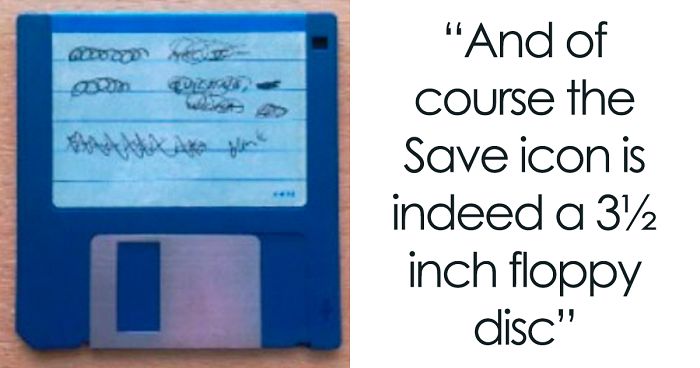
Jokingly, he said that kids today are surprised to learn that the save icon is actually a 3.5-inch floppy disk—because that’s where we used to save a lot of our digital things before all these terabytes we don’t know what to do with nowadays—and he, today, is surprised to learn that upper and lower case refers to actual cases, boxes.
These were used in old printing presses, with one part of the box containing all of the capitalized letters and the other having the non-capitalized ones. One is, hence, the upper case, the other is the lower case.
It all started off with one user explaining the origins of upper– and lowercase letters
")
Image credits: verstaen
This led to a number of people sharing similar typography-related terms and providing their etymologies, further blowing the minds of other tweeters.
And it lead to many others explaining the origins of other typographical terms and icon
")
Image credits: miopapio
")
Image credits: mackie_don
")
Image credits: thorpej
")
Image credits: pfarqeu
For instance, the word font has a common root with found and hence foundry, referring to how olden printing used to be done. Also, leading refers to the size of the lead strips used to create the spaces that lead the type.
Another lesser-known fact is that keyboards now have a shift key, which refers to the action of shifting the entire type bar on typewriters between upper and lowercase characters.
Needless to say, the terms cutting and pasting, while still being used today, refer to actual cutting of the printed text using scissors and pasting it using glue as part of the editing process.
Everything from fonts and foundries to leading and copy/pasting were mentioned in the thread
")
Image credits: HenninghamPress
")
Image credits: KatrinaTransfem
")
Image credits: MoonfacedAssassin
")
Image credits: MaxwellUltracynicLamb
")
Image credits: quizicist
This little fountain of knowledge quickly shifted to a whole different social media where it was elaborated upon by Tumblr user Peter Morwood with visual shorthand icons and graphics about writing still using fountain pens, typewriters, and the sort—as opposed to monitors, keyboards, and other modern tech actually used today.
It also discusses the aforementioned 3.5-inch floppy disks as well as the shape of the phone icon for accepting and ending calls—these are in the shape of a curved phone with a visible speaker and microphone part to it, whereas today’s most commonly used phones are in the shape of a slate.
The tweets also found their way to Tumblr, where Peter Morwood elaborated on it with writing icons
")
")
")
")
")
Image credits: petermorwood
The post also discussed the origins of phone depictions and elaborated on “save” icons
")
")
")
")
")
")
")
")
")
Image credits: petermorwood
People were so hooked on this that the tweet thread went viral. It garnered over 42,700 likes with almost 15,000 retweets on Twitter alone, with another 71,800 notes on Tumblr. Imgur also got a hold of this and the repost got over 91,000 views with almost 4,000 upvotes.
What are your thoughts on this? Have any interesting etymologies to share with other Pandas? Let us know in the comment section below!
37Kviews
Share on Facebook


And, mind your p's and q's because they are mirror image after they print. As in pq side by side in the case.
Another piece of info- the raised lines on the letters f and j on a keyboard are for you to place your index fingers on to locate all the keys.
Well I didn't know That, and I did wonder. I've worked as a typist btw, so i guess i learned it a different way? I dont know how but my hands seem to know where the letters r, I'm more self taught but still 80-100wpm when I'm out of practice :)
Load More Replies...The floppy disk icon is 3.5 inch disk rather than 5.25 inch because Apple created the icon and at the time Apple used the smaller disks while PCs used the larger version. Many standard icons started as Apple-only images because they were more firmly connected to a graphical interface at a time when PC users were typing command line stuff in DOS. Apple sued Microsoft when they released Windows for copying their look and feel, including most of the icons.
If I remember correctly, the "trashcan" icon was judged to be a copyright infringement, which is why Windows still has a "recycling bin" instead of a trashcan.
Load More Replies...The 5 1/4" floppy disk makes for a terrible icon, as it looks like a power icon (I/O, which represents 1 and 0, or 'on and off' for a singular function in the binary language).
I would see more of a problem with the icon looking like a weird exclamation mark in a square when used at small sizes like in an icon bar.
Load More Replies...Many years ago I found one of my grandfather's calligraphy practice books. The copyright was 1899, that was when he was in college. Even back then they were called fonts. I do remember Arial, Serif and Sans Serif, Old English, Helvetica, and more I can't remember. I have been sitting behind computers for 34 years, half of my life. I started with DOS. Maybe because I like to read, I already knew all of these facts. Do you know why it is called an "em" space? Because back in the days of movable typesetting the capital M was the widest spaced letter. The capital I, an "en" space, was the narrowest. Typesetters needed that to be able to plan their set-up.
I learned how to type on a typewriter. I loved that return button. Especially on a really heavy one. N
The old ones had a lever and you had to push it to return the whole carriage.
Load More Replies...Addendum to the one on carriage return: And line feed is when you push the typewriter back to the start of the line. Many programmers will know these, as carriage return and line feed are two different ascii symbols chr(10) and chr(13) and are treated differently in Windows vs Linux (\n or \n\r). If you line feed without carriage return, you start overwriting the text you just wrote, and if you carriage return without line feed, you start your next line most of the way down the page.
Also, a "stereotype" is a block of type that's made as a single piece so it can be reused to print the same text. And the French word for it is "cliché".
And the word "Ye" as in "Ye Olde Town" is pronounced "the". The "Y" was used to represent an old English letter called "thorn" which was pronounced as "th". But the German printing presses (that's where they were effectively invented) didn't have thorn letters in the cases, since that letter wasn't in the German language. So they used to closest letter they did have, "Y". After a while of not seeing it in print, thorn got dropped from the English language.
The history of typography is more interesting than one would think. A lot of weirdness. Like John Gill, creator of Gill Sans and others (check Word and you'll see them), was making happy with his own daughter. Check out a book called "Just My Type" by Simon Garfield.
Load More Replies...Huh. Had to delete the other comment I made. Turns out "cliche" is past participle of French "to click", and referred to originally as the thing that repeatedly made the same image/word over and over, which was 'clicked' into place. Onomatopoeia. (Which sounds nothing like what it describes, ironically enough.)
Load More Replies...i know this is shocking but what's exciting to others doesn't revolve around you
Load More Replies...And, mind your p's and q's because they are mirror image after they print. As in pq side by side in the case.
Another piece of info- the raised lines on the letters f and j on a keyboard are for you to place your index fingers on to locate all the keys.
Well I didn't know That, and I did wonder. I've worked as a typist btw, so i guess i learned it a different way? I dont know how but my hands seem to know where the letters r, I'm more self taught but still 80-100wpm when I'm out of practice :)
Load More Replies...The floppy disk icon is 3.5 inch disk rather than 5.25 inch because Apple created the icon and at the time Apple used the smaller disks while PCs used the larger version. Many standard icons started as Apple-only images because they were more firmly connected to a graphical interface at a time when PC users were typing command line stuff in DOS. Apple sued Microsoft when they released Windows for copying their look and feel, including most of the icons.
If I remember correctly, the "trashcan" icon was judged to be a copyright infringement, which is why Windows still has a "recycling bin" instead of a trashcan.
Load More Replies...The 5 1/4" floppy disk makes for a terrible icon, as it looks like a power icon (I/O, which represents 1 and 0, or 'on and off' for a singular function in the binary language).
I would see more of a problem with the icon looking like a weird exclamation mark in a square when used at small sizes like in an icon bar.
Load More Replies...Many years ago I found one of my grandfather's calligraphy practice books. The copyright was 1899, that was when he was in college. Even back then they were called fonts. I do remember Arial, Serif and Sans Serif, Old English, Helvetica, and more I can't remember. I have been sitting behind computers for 34 years, half of my life. I started with DOS. Maybe because I like to read, I already knew all of these facts. Do you know why it is called an "em" space? Because back in the days of movable typesetting the capital M was the widest spaced letter. The capital I, an "en" space, was the narrowest. Typesetters needed that to be able to plan their set-up.
I learned how to type on a typewriter. I loved that return button. Especially on a really heavy one. N
The old ones had a lever and you had to push it to return the whole carriage.
Load More Replies...Addendum to the one on carriage return: And line feed is when you push the typewriter back to the start of the line. Many programmers will know these, as carriage return and line feed are two different ascii symbols chr(10) and chr(13) and are treated differently in Windows vs Linux (\n or \n\r). If you line feed without carriage return, you start overwriting the text you just wrote, and if you carriage return without line feed, you start your next line most of the way down the page.
Also, a "stereotype" is a block of type that's made as a single piece so it can be reused to print the same text. And the French word for it is "cliché".
And the word "Ye" as in "Ye Olde Town" is pronounced "the". The "Y" was used to represent an old English letter called "thorn" which was pronounced as "th". But the German printing presses (that's where they were effectively invented) didn't have thorn letters in the cases, since that letter wasn't in the German language. So they used to closest letter they did have, "Y". After a while of not seeing it in print, thorn got dropped from the English language.
The history of typography is more interesting than one would think. A lot of weirdness. Like John Gill, creator of Gill Sans and others (check Word and you'll see them), was making happy with his own daughter. Check out a book called "Just My Type" by Simon Garfield.
Load More Replies...Huh. Had to delete the other comment I made. Turns out "cliche" is past participle of French "to click", and referred to originally as the thing that repeatedly made the same image/word over and over, which was 'clicked' into place. Onomatopoeia. (Which sounds nothing like what it describes, ironically enough.)
Load More Replies...i know this is shocking but what's exciting to others doesn't revolve around you
Load More Replies...
178
52