Designer Pairs Pantone Swatches With Tiny Everyday Objects
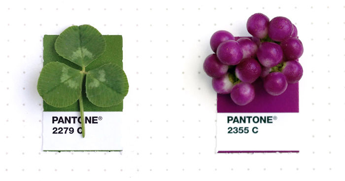
Inka Mathew, a Texas-based graphic designer and owner of Green Ink Studio, matches tiny, everyday objects from ladybugs to jelly beans with their corresponding Pantone colour swatches.
In a personal project called Tiny PMS Match, Mathew combines everyday items with their Pantone Matching System (PMS). The objects she uses “pique her interest and/or have special meaning.”
She uses her phone and natural light to snap the object placed on top of the color chip. Despite the challenges in getting the colours matched, Mathew said she has a 95-percent success rate, and since starting the project in 2014, has snapped 145 images so far. In Spring 2016, she will publish a hardback book with previously unseen matches. Until then, she’ll continue posting sneak peaks on the project’s Tumblr account.
More information: greeninkstudio.com | Instagram | Tumblr | Twitter (h/t: mymodernmet)


30Kviews
Share on Facebook

Posters of these colour swatches would be great. I would hang them in my home.
These are cute, I like the scale of the objects and the pantone piece of paper.
Those are tar-off swatches from a big Pantone color process book. Companys use to get their company colors correct on collateral items: ie: brochures, posters, banners, flyers, etc.
Load More Replies...I have been a graphic designer for almost 10 years and at one point, I questioned about these colors and wondered if anything real has those colors. Thanks for answering my question!!!
Usually, people don't manage to see how colourful is the world around them. I wonderful selection. I like it a lot. :)
You could have simply said you don't understand the purpose without adding the insult "Dumb". It's ok to lack understanding of something. It isn't ok to insult the other for your own ability to comprehend.
Load More Replies...Posters of these colour swatches would be great. I would hang them in my home.
These are cute, I like the scale of the objects and the pantone piece of paper.
Those are tar-off swatches from a big Pantone color process book. Companys use to get their company colors correct on collateral items: ie: brochures, posters, banners, flyers, etc.
Load More Replies...I have been a graphic designer for almost 10 years and at one point, I questioned about these colors and wondered if anything real has those colors. Thanks for answering my question!!!
Usually, people don't manage to see how colourful is the world around them. I wonderful selection. I like it a lot. :)
You could have simply said you don't understand the purpose without adding the insult "Dumb". It's ok to lack understanding of something. It isn't ok to insult the other for your own ability to comprehend.
Load More Replies...
105
21