Interior Designers Create 6 Different Nature-Inspired Designs For One Living Room
Have you ever been to one of the mesmerizing landscapes in the world and thought to yourself that you wish you could bring the scenery back home with you? It doesn’t necessarily have to be a photo wallpaper or fifty shades of green in one place—you can bring home the palette of nature in a very tasteful way that will preserve its feel while complementing and enhancing your decor.
Interior designers at HomeAdvisor decided to bring the great outdoors inside people‘s homes. They identified the color schemes of six examples of the breathtaking beauty of nature around the world and used those colors to digitally decorate the same exact living room. They took inspiration from the vivid colors and tones of the outstanding Grand Canyon, the Great Barrier Reef, Yellowstone Caldera, Mount Fuji, Banff National Park, and the Serengeti National Park, which resulted in vibrant nature-inspired designs.
So next time you decide to re-decorate your interior, instead of turning to fancy magazines, maybe you should borrow some iconic ideas from already perfectly balanced Mother Nature?
More info: homeadvisor.com
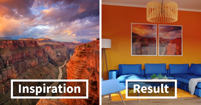
Grand Canyon (Arizona, USA)

Image credits: homeadvisor
“At a casual glance, the colors of the Grand Canyon are minimal: the ruddy yellows of the rock and the piercing blue of the sky. But between these shades exists an infinity of gradations, tinted shadows, shifting light, and varying saturation. In a word: drama.”

Image credits: homeadvisor
“This invigorating sense of color could dominate a room, and it’s true that our Grand Canyon lounge is not for the quietly reclusive. The warm, saturated orange walls are designed to invite guests in, while the cooler blue suite offers a refuge from the inferno. Notice, too, how we’ve complemented this baking-hot color scheme with houseplants to match – as we have with the other living rooms in our series.”
Yellowstone Caldera (Wyoming, USA)

Image credits: homeadvisor
“If you assume you know what colors you’re getting with ‘Yellow’-stone, you’ve never seen an aerial shot of the caldera – the ‘cauldron’ left in the mountain by volcanic super-eruptions. Billions of microscopic creatures live in the blistering spring waters of the cauldron, and these different microbes thrive in different circumstances – conjuring different hues as a response to their environment. Pretty!”

Image credits: homeadvisor
“You don’t need to be a microbiologist to harness the chromatic wonder of the Yellowstone Caldera. Like our Mount Fuji room, the Yellowstone lounge illustrates how to tame wild colors with the calming influence of a pale wall. The blues of the armchair and rug combine to ‘zone’ the living room, while that fabulous rubber plant echoes the overall exuberance of the space.”
Mount Fuji (Honshu Island, Japan)

Image credits: homeadvisor
“Japan’s highest mountain is a dormant volcano and an object of worship and contemplation for the Japanese people. These include the ukiyo-e artist Hokusai, whose famous 19th-century print series, Thirty-six Views of Mount Fuji, continues to grace many walls today as a popular painting reproduction. Fuji’s colors remain iconic even as they are celebrated for their mutability – their ever-changing quality as the seasons and blossoms come and go.”

Image credits: homeadvisor
“Those blossoms form the focal point of our Mount Fuji living room. The blossom-pink suite is a bold statement, tempered by the delicate highlights of the mountain-blue curtains and forest-hued sideboard. The snow-white walls allow these captivating colors to thrive without overwhelming. This is a room for quieting overactive minds.”
Banff National Park (Alberta, Canada)

Image credits: homeadvisor
“The shocking gold of Banff’s fall look is well-celebrated, but we decided to sample the park in wintertime. Sometimes the simplest way to find harmony in your space is to keep to an area of the color wheel that you find touches you the most. Banff National Park is cool and epic when the sun is low.”

Image credits: homeadvisor
“With quieter shades and a reigned-in range, you can afford to splash out on the walls. We borrowed this shade of teal from the waters of Banff National Park’s glacial lakes, and it’s a cold lake swim for the soul. As a final note, check back through our images above to see how we’ve brought together sometimes disparate palettes with a single piece of art on the walls. Stray colors make a lot more sense when given an anchoring context.”
Great Barrier Reef (Australia)

Image credits: homeadvisor
“The world’s largest coral reef has become a byword for color. Over 400 species of coral form the reef (to say nothing of the colorful abundance of fish, mollusks, and birds). Their coloring plays an essential role in survival. For example, colors such as pink, blue, and purple protect coral against high levels of UV rays. Because the color actually comes from beneficial organisms that live within the coral, faded colors are a sign of ill health. In other words, go bright for a healthy look.”

Image credits: homeadvisor
“We chose some of the Great Barrier Reef’s most iconic colors for our living room palette. The deep cyan walls evoke the sub-aquatic life. Just as you imagine the light shimmering and changing underwater, dark walls like this can actually maximize the dramatic effect of natural light in a room. The gold sofa and bright rug create a natural spotlight so that the room remains both bright and mysterious.”
Serengeti National Park (Northern Tanzania)

Image credits: homeadvisor
“‘The great migrating herds of wildebeests and zebras are probably the single most impressive sight,’ wrote Richard Leakey of his childhood explorations of the Serengeti. ‘Although the endless plains, fantastic clouds, and kaleidoscope of natural colors are pretty hard to best.’ From its signature golden sunsets to its rainbow of grass hues, the Serengeti palette is a bold and pungent world wonder.”

Image credits: homeadvisor
“You needn’t worry about being stalked by a lion in our Serengeti lounge. We’ve made a major feature of that verdant green, creating a room that is instantly calming. Green is timeless yet right in fashion at the moment: the paler ‘Back To Nature’-green is Behr’s Color of the Year. While the paint company imagined the hue as a fresh start to a new decade (oops!), green certainly chimes with the calm and creativity that we’re learning to cultivate in our homes. And that sunset shade of gold is the color of optimism all the way down.”
10Kviews
Share on Facebook


this is incredibly refreshing, i'm so sick of everything i see from "top designers" and on HGTV being endless neutral tones. use some color! color is not scary! i love most of these, the mt fuji one is the only one i'm sort of eh about.
Tbh, the mount fuji one is the ones I like best. But I prefer calming tones over bright colors, and I do get why people like happy, colorful rooms. Not everyone has to ike the same things :)
Load More Replies...I really love these "rooms," but what I really love is having a huge photo of the area that inspired the colors. I may do this myself
That is not supposed to look like gradient painting. It is the play of light and shadow on the wall.
Load More Replies...I like the Grand Canyon one the best, and Mount Fuji / Barrier Reef ones the least.
OOOOOO I ADORE THE MT. FUJI ONE! The pastel color pallete is so cozy looking, I love it! <3
Beautiful colours, but SO dark! Might work for a bedroom, but a living room? (Uh-oh, I am getting old)
My daughter just told me the National Park service has more of these decor pallets available on Instagram. I really want to this, and I love the inspiration photo as a focal point

83
35