40 Times People Didn’t Take Letter Spacing Into Consideration And It Resulted In These Fails
Kerning is the process of adjusting the spacing between individual characters in a font. This is done to achieve a visually pleasing and balanced appearance of the text. But as with most things, every now and then, things can go wrong.
Put the symbols too close or too far from one another and you end up with awkward or humorous typography. For example, if a company wanted to make a poster advertising their "cleaning" services but made the spacing between the letters "c" and "l" too tight, it can create the word "dining" instead.
The funny part is that such mistakes are more common than we might think. And the Facebook group 'The Real Crime Is That Kerning' has all the proof. Here are some of their finds.
This post may include affiliate links.


Finals

Design is full of detail-level concepts that matter more than their superficial simplicity would suggest, and kerning is a great example. When used effectively, it can be a powerful tool to influence aesthetics and communication through type.
It’s one of those things that, when used well, shouldn't be noticed by the average reader.
"If you start to look for it," designer Madeline DeCotes said, "you’ll realize there’s so much more to letters than you thought possible."
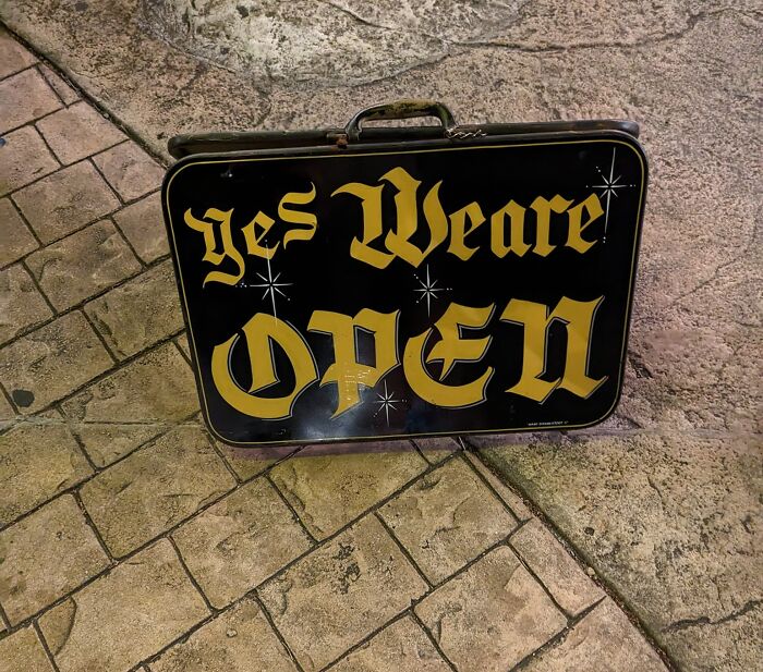
We Are Open

Unlike tracking, which adjusts the amount of space between the letters of an entire word in equal increments, kerning focuses on how type looks — creating visually pleasing and readable text.
Typeface designers build spaces around each letter, and sometimes between pairs of letters. But as we can see in the pictures, those spaces don’t always work in all situations, especially if you’re using a typeface in a way the designer didn’t foresee.
That’s when manual kerning comes in. Because beauty is in the eye of the beholder, no two kerning jobs will be the same.
Dishwasher

If You Go Hiking In The Bamboo Forest, You Better Check For Ticks

In Nails I Trust

The Real Crime Is You Knew Darn Well What That Looked Like And Sent It To Print Anyway

"Kerning is a strikingly subjective art form," DeCotes explained.
"The designer needs to look at the space between each letter in a word and ask, 'Does this look like enough space? Does it look like too much? Are the letters too tight?'"
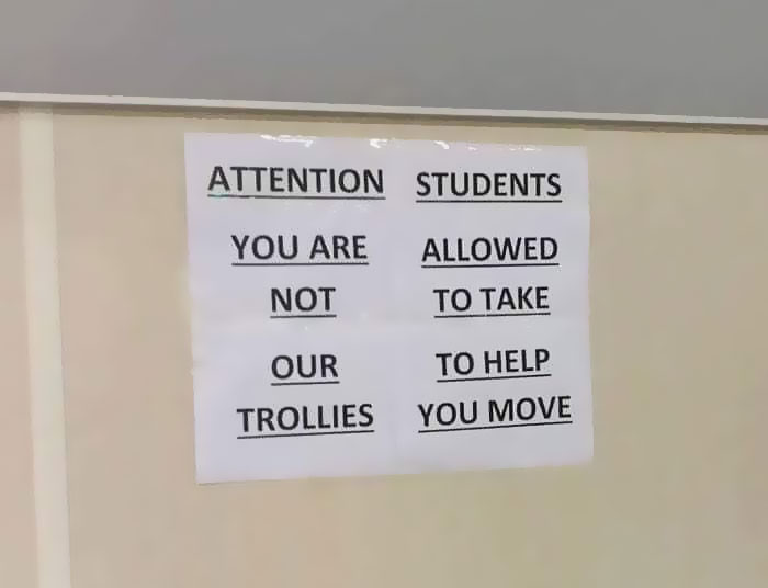
Apply At..???

They are hiring both lice and nsed stylists without applications, but hair needs to apply.
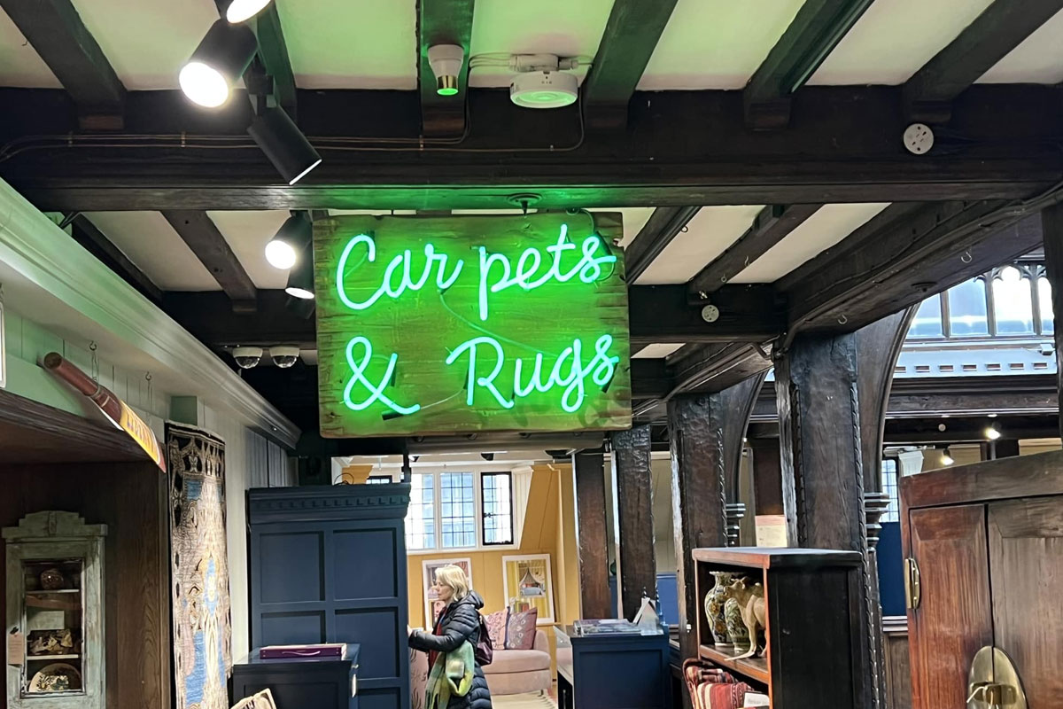
Car Pets Are The Best Pets

Bad kerning is so common that graphic designers even have a name for it: keming (which looks like kerning has itself suffered from bad kerning).
If there were hard and fast rules around kerning, every font would automatically generate perfectly kerned character pairs. But because kerning is in many ways a subjective pursuit, the only thing anyone can say with certainty is that kerning is bad if it renders something unreadable.
This leaves a lot of (or a little) space for interpretation.
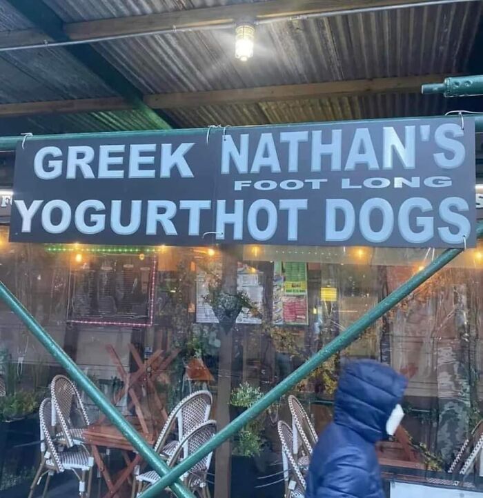
Good Job, Walmart. If You Could Just Schooch The "Gurt" A Little To The Left

Wot & Who?

I honestly cannot figure this one out - and as a language teacher I am used to some next-level spelling mistakes. Help?
Pudding Turkey!

I Love Le Cher (French Department) vs. I Love Lécher (To Lick)
 vs. I Love Lécher (To Lick)")
Not every project requires kerning by hand, but there are some instances when it may be better off if you give special time and attention to this detail:
- Headlines. Document headlines—or any time you make a font a larger point size in your document—can change the way the font kerning looks. You may find that you need to adjust the kerning of a headline to make the characters appear to have the same space between them as they do at a smaller point.
- Large formats. Like headlines, large-format projects—think banners and billboards—can create kerning issues. This is because, at smaller point sizes, characters need more space between them to be legible. When that same font is blown up to billboard size, kerning that once made it easy to read now makes it look a little sloppy. This is the perfect time to kern by hand.
- Logos. Creating a logo that includes typography requires special consideration for kerning. Not only is it a matter of taste and preference, but you must consider the myriad sizes in which your logo may be printed.
Shampoo

W Hyy Yyyyy???

I Guess It's More Font Choice, But The High School That My Girlfriend Teaches At Is Fort White High School, But All I See Is Fart White In Their Gym

Some Are Neon The Kerning Thing

"If you’re not a designer, it’s not something you think about," DeCotes said. "People don’t realize anytime they see giant text, whether it’s on a poster, a billboard, or a website, headline fonts have probably been thoughtfully kerned.”
Assuming it's been executed well, of course!
Nope I'll Get Mine Done Somewhere Else

He Is Trisen

6nly Sod Gan Gugjmel

It's Rush Because Go Time!

Finally Found One In The Wild!

Amazing Pizza. Atrocious Kerning

Cool Craft Bar In Richmond

I Just Saw This In A Market In Georgia Today And Could Not Stop Laughing. You’re Welcome

Finally Found Something

Please Don

Found In The Wild At Our Local O'charley's

A While Ago I Was An Extra On The Last Of Us, And I Had To Wait To Share This

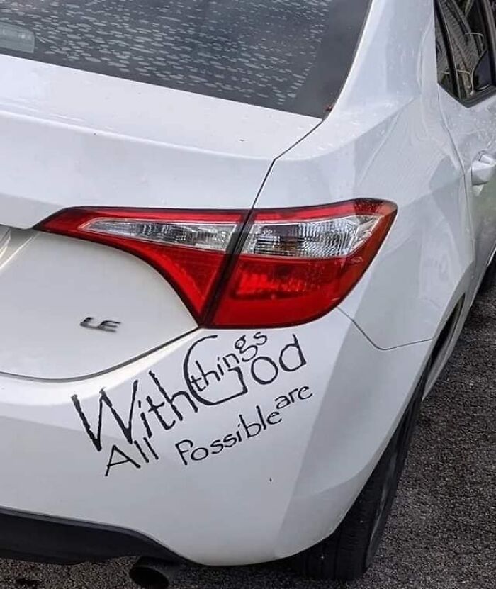
Today I Learned That Automotive Professionals Are Not Typesetting Professionals

This happens when people are not sure if there is supposed to be an apostrophe before the S, so they leave a gap just in case, to please both sides of the argument.


Love It!

Chips

It's french and english. It's a requirement of products sold in Canada. But the spacing/kernel is a little out of whack
Saw In The Wild And Thought Of You All

Something I Hated Today

The Closer You Look, The Worse It Gets

Saw This At A Local Park Today And Knew I Had To Snap A Pic To Share

Wait... I'm Confused. Is The Food From China Or Togo?

It’s Not Like They Didn’t Have Enoughroom

This Stresses Me Out. In The Living Room Of A Sober Living House. I Feel Like They Weren’t Very Sober When They Did This

Received This At A Breast Cancer Survivors Dinner. Appreciate The Sentiment, But I Will Always See Adjust, Brethren!


From One Of My Child’s Books From School. If Only Ben Jamin Franklin Would Have F Ound A Way To Improve This Keming

Ben Jamin........I want Ben Jamin with you.........Ben Jamin.......Jamin.......And I hope you're Ben Jamin too
Smell Ya Later, Smenu

I Mean Come On

This Has Bothered Me For Years. And It's Not Just Decals - All Of Their Signs Are Like This, Too

Church Of Bod Douth Balls

Font Shaming And Spelling Issues? I Want This To Say *exploring* But It Just Doesn’t

Hahahahaha Forgive Me This Isn’t Strictly A Kerning Issue But It Made Me Laugh

Home Ffice? Hom Effice?

Axe Body Spray End Cap Display At Walmart


B A Ylea Ves Spotted At A Local Market

Anniversary Dinner At The Tas T Ingroom

I Got This T-Shirt At A Conference And It Bothers Me To This Day

Sadly, a lot of programs won't let you adjust the kerning of just one letter, so you have to pick better fonts.

Sinkist?

Once you see it can never be unseen. Also, the arrow in the FedEx logo.
"We Can't Make It Any Tighter!" "Do It Anyway!"

The Spacing, The Backwards Letters Scattered Throughout. It’s All Just A Mess

Apparently there is still time to fix it😂 (edit: my bad, typical American assuming it meant August and not April. God we are self centered!)
I Just Saw This Posted In A News Article - Better Kerning Might Have Left Space For The Whole Word To Fit. Image Of A School With "The School District Of Philadelph" In Shiny Block Letters


Whotels

I Hate The Way The Letter 'H' Looks, Too. Can't Stop Seeing A 'Ђ'


So many of these are not kerning issues. Words out of order is not an example of bad kerning. Same for spelling errors or hard to read fonts. Really frustrating since the writer took the time to explain what kerning is, and then proceeded to give us a list that mostly has nothing to do with it.
I feel like that's most BP posts. The title and purpose are completely skewed by at least the third one down. I just try not to think about it, too much, and enjoy the funny posts. :/
Load More Replies...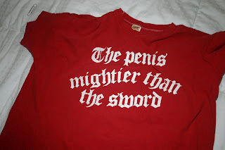
There is a hashtag for college sports team in Colorado (Thunderwolves) that is #Gothunderwolves. I know it is supposed to be “go thunderwolves” but it can also be read as “goth under wolves “ making it seem like twilight themed smut. It’s more of a phrasing error than a kerning error though.
So many of these are not kerning issues. Words out of order is not an example of bad kerning. Same for spelling errors or hard to read fonts. Really frustrating since the writer took the time to explain what kerning is, and then proceeded to give us a list that mostly has nothing to do with it.
I feel like that's most BP posts. The title and purpose are completely skewed by at least the third one down. I just try not to think about it, too much, and enjoy the funny posts. :/
Load More Replies...There is a hashtag for college sports team in Colorado (Thunderwolves) that is #Gothunderwolves. I know it is supposed to be “go thunderwolves” but it can also be read as “goth under wolves “ making it seem like twilight themed smut. It’s more of a phrasing error than a kerning error though.
