Businesses And Brands Have To Re-Paint Their Logos In Kyoto Due To City’s Strict Landscaping Guidelines And Here’s How It Looks (12 Examples)
As it turns out, the city of Kyoto, Japan has strict rules for city planning
")
Image credits: Victor Gusukuma
The city of Kyoto is planned so as to preserve its historical scenery. For this reason, in 2007, the Miyako Landscape Guidelines were created that set strict rules and regulations regarding the height, color, and design of buildings, including even their outdoor advertisements. The set of rules basically prevent buildings, signs, etc. from clashing with the original image of Kyoto and its rich heritage.
")
Image credits: Victor Gusukuma
In the city, the logos and signs of businesses must be adapted to fit the original scenery
")
Image credits: Victor Gusukuma
Tsunagu Japan has outlined some of the regulations for the city: “Roof tiles are to be silver-colored,” “Metal sheets other than copper sheets must be dark gray or black with no gloss,” and, “Walls with R hues [on the Munsell system] may not exceed 6 in value.” This the reason why logos of businesses and enterprises look slightly different in Kyoto than elsewhere in the world.
")
Image credits: Victor Gusukuma
The strict guidelines were enforced back in 2007
")
Image credits: Victor Gusukuma
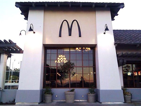
One of the world’s most popular fast food chains—McDonald’s—is known for its yellow letter M on a red background. In Kyoto, however, while the logo is yellow, the overall design is sepia-colored and blends in with the rest of the surrounding buildings. Like most stores in the city, McDonald’s used a brown color for the background in order to maintain Kyoto’s overall style.
")
Image credits: Victor Gusukuma
They usually involve changing the colors of the logos
")
Image credits: Victor Gusukuma
Lawson is yet another majorly popular convenience store in Japan that recently branched out to Indonesia, China, the Philippines, and Thailand. The original design of the store features light blue and pink colors. In Kyoto, the logo design is toned down, and the light blue color is used only as an accent.
")
Image credits: Victor Gusukuma
Global as well as local brands have to adapt to the city’s brownish color scheme
")
Image credits: Victor Gusukuma
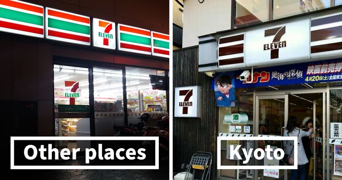
Starbucks—which is known for its white and green-colored logo—also altered its sign in Kyoto to blend in with traditional Kyoto-style houses. Same goes for 7-Eleven, a chain of convenience stores with 20,000 branches in Japan and 60,000 worldwide. All around the world, it has a bright logo with orange, red, and green stripes. In Kyoto, the logo features a calm combination of brown and white. Tsunagu Japan writes that while some branches have maintained the original colorful logo, they made the white stripes transparent to make them blend in more with the surroundings.
")
Image credits: Victor Gusukuma
In order to maintain the harmonious scenery of the ancient Japanese city
")
Image credits: Victor Gusukuma
Japanese clothing brand Uniqlo, which is known for its affordable yet high-quality clothes, has over 2,000 branches all around the world. Its logo features white text in a square bright red logo. Some branches of the store in Kyoto have framed the logo with a white border to make it look more elegant.
")
Image credits: Victor Gusukuma
However, not only buildings are painted brown
")
Image credits: buraburakyoto
However, the style guidelines are applied not only to buildings. In Kyoto, vending machines, street cones, mailboxes, and telephone booths are dyed in a brown-ish color to fit the overall chic vibe of the city.
")
Image credits: buraburakyoto
But also the city’s mailboxes, street cones, and telephone booths
")
Image credits: buraburakyoto
")
Image credits: buraburakyoto
Have you ever been to Kyoto? Did you notice the city’s color scheme? Share in the comments down below!
")
Image credits: buraburakyoto
96Kviews
Share on Facebook


I don't know about those brown traffic cones, though... They're supposed to be highly visible and I feel like I wouldn't see brown cones and would just run them over...
There is a turquoise McDonalds (the only one in the world) in Sedona Arizona for the same reason. Their color scheme was denied because it would clash with the natural beauty of their red rocks.
This is highly unusual but shouldn't be. There are countless streets, neighborhoods and even entire cities with noise ordinances - why not address the visual noise as well? To me it makes a city just as jarring and disorientating as car horns and blaring music that gets fined.
I wonder if they stand out when all you see is monochromatic?
Load More Replies...Actually, having been to Kyoto, I can assume it's only certain areas of Kyoto where this rule is applied. I definitely saw plenty of family marts with coloured signage, as well as plenty of colour from other various stores/cafes etc.
Was going to say this as well, I've been twice and there is definitely parts of Kyoto that are super bright and neon, including a Lawson near my air bnb which was green (it was a Lawson 100) but the McDonalds near my hotel when I went the first time, was brown.
Load More Replies...It's Starbucks Coffee Kyoto Ninenzaka Yasaka Chaya, and it's in a very beautiful traditional part of the city, near/on Ninen Zaka path.
Load More Replies...I have seen this in the US. There was a small area in Raleigh, NC done in browns and beige. I think I saw the same thing in Texas too. It does look less commercial. But isn't easy to find the McDonalds
We do the same here in México in small towns to avoid sore-thumbs :D
It's not uncommon for cities to impose rules in order to preserve the "original" esthetic of a building or neighbourhood or to create uniformity in the displays and signs. In some cases their UNESCO recognition depends on it.
This is pretty common in many US smaller cities as well. Some near me even have strict guidelines about street signs and a ban on billboards or signs over certain height.
I would be a nice wood scheme. But brown and monochrome for legit everything would be slightly... slightly less interesting. No offence. 👁👄👁
I definitely prefer the muted tones on the signs. There are so many strip malls with a huge variety of shops near me and it actually makes my brain a little tired when I look at the jumble of colored neon signs everywhere.
I've seen somethign similar in the medieval city of Rothenburg ob der Tauber. They have these very elaborate metal signs and I've seen brands like drugstores do the same thing. I'm fairly sure, though that one is voluntary. It is very cute.
Kyoto also has a lot of streets with no names, streets where no cars are allowed, and some of the best food in Japan. It's definitely low key there and people like it that way.
this kind of reminds me of lord business's Bricksburg in the Lego Movie... I know it's not meant to brainwash people here, but it feels the same.
Here in longbeach, Wa the MacDonald sign had to be out on the side of its building because of an ordinance forbidding structures being seen from the beach
I've been to Kyoto. The MacDonalds outside the station is the same colour as the normal one. So this one must be in a specific place?
My guess is in the truly historical areas you won’t see the garish colors. The Starbucks in Kyoto has a beautiful exterior and fascinating interior as it was a restored home. It’s a win for all visitors to the area. If you have never been to Japan, put it on your bucket list. It is one of the magical places on earth. Lived there twice. Still can’t get enough!!
Load More Replies...There’s a city in Indiana where every store is brick, so McDonald’s doesn’t look like McDonald’s.
When I visited Kyoto I thought most new businesses were built into old traditional buildings with minor upgrades...interesting.
In Puerto Varas, Chile, all commercial signs have to be made of wood to keep harmony with the style of the city.
Yes, like when the 3/11 earthquake and tsunami hit Japan, only landlines functioned, the rest were overwhelmed. Also, when some other disaster hits and you escape with only the clothes on your back, you still have landlines to call for help. It's Japan, lots happening here.
Load More Replies...Doing it this way, the KYOTO way, can hurt businesses cause of this. Colors are very important when we make everyday choices without us even paying attention. We don't even know it cause we are so used to our ways, traditions, etc. But when it is taken away, we notice the change and then we sit back and see how it affects our everyday life. Imagine if nothing is colored ( live a day of someone that can't see any color), forgot the name of the eye disease, but it would be so bad for us. Then when u see those ppl wear those special glasses and see's color for the first time, their faces and their reactions are so noticeably priceless! So, even though these are just simple signs of places, it would affect so many ways. So, in my opinion, it's not a good idea.
Crap-someone please send me to the Er, I think I am dying of lack of color
It's not about government control, it's a very historic site. Kind of like downtown Boston here.
Load More Replies...I don't know about those brown traffic cones, though... They're supposed to be highly visible and I feel like I wouldn't see brown cones and would just run them over...
There is a turquoise McDonalds (the only one in the world) in Sedona Arizona for the same reason. Their color scheme was denied because it would clash with the natural beauty of their red rocks.
This is highly unusual but shouldn't be. There are countless streets, neighborhoods and even entire cities with noise ordinances - why not address the visual noise as well? To me it makes a city just as jarring and disorientating as car horns and blaring music that gets fined.
I wonder if they stand out when all you see is monochromatic?
Load More Replies...Actually, having been to Kyoto, I can assume it's only certain areas of Kyoto where this rule is applied. I definitely saw plenty of family marts with coloured signage, as well as plenty of colour from other various stores/cafes etc.
Was going to say this as well, I've been twice and there is definitely parts of Kyoto that are super bright and neon, including a Lawson near my air bnb which was green (it was a Lawson 100) but the McDonalds near my hotel when I went the first time, was brown.
Load More Replies...It's Starbucks Coffee Kyoto Ninenzaka Yasaka Chaya, and it's in a very beautiful traditional part of the city, near/on Ninen Zaka path.
Load More Replies...I have seen this in the US. There was a small area in Raleigh, NC done in browns and beige. I think I saw the same thing in Texas too. It does look less commercial. But isn't easy to find the McDonalds
We do the same here in México in small towns to avoid sore-thumbs :D
It's not uncommon for cities to impose rules in order to preserve the "original" esthetic of a building or neighbourhood or to create uniformity in the displays and signs. In some cases their UNESCO recognition depends on it.
This is pretty common in many US smaller cities as well. Some near me even have strict guidelines about street signs and a ban on billboards or signs over certain height.
I would be a nice wood scheme. But brown and monochrome for legit everything would be slightly... slightly less interesting. No offence. 👁👄👁
I definitely prefer the muted tones on the signs. There are so many strip malls with a huge variety of shops near me and it actually makes my brain a little tired when I look at the jumble of colored neon signs everywhere.
I've seen somethign similar in the medieval city of Rothenburg ob der Tauber. They have these very elaborate metal signs and I've seen brands like drugstores do the same thing. I'm fairly sure, though that one is voluntary. It is very cute.
Kyoto also has a lot of streets with no names, streets where no cars are allowed, and some of the best food in Japan. It's definitely low key there and people like it that way.
this kind of reminds me of lord business's Bricksburg in the Lego Movie... I know it's not meant to brainwash people here, but it feels the same.
Here in longbeach, Wa the MacDonald sign had to be out on the side of its building because of an ordinance forbidding structures being seen from the beach
I've been to Kyoto. The MacDonalds outside the station is the same colour as the normal one. So this one must be in a specific place?
My guess is in the truly historical areas you won’t see the garish colors. The Starbucks in Kyoto has a beautiful exterior and fascinating interior as it was a restored home. It’s a win for all visitors to the area. If you have never been to Japan, put it on your bucket list. It is one of the magical places on earth. Lived there twice. Still can’t get enough!!
Load More Replies...There’s a city in Indiana where every store is brick, so McDonald’s doesn’t look like McDonald’s.
When I visited Kyoto I thought most new businesses were built into old traditional buildings with minor upgrades...interesting.
In Puerto Varas, Chile, all commercial signs have to be made of wood to keep harmony with the style of the city.
Yes, like when the 3/11 earthquake and tsunami hit Japan, only landlines functioned, the rest were overwhelmed. Also, when some other disaster hits and you escape with only the clothes on your back, you still have landlines to call for help. It's Japan, lots happening here.
Load More Replies...Doing it this way, the KYOTO way, can hurt businesses cause of this. Colors are very important when we make everyday choices without us even paying attention. We don't even know it cause we are so used to our ways, traditions, etc. But when it is taken away, we notice the change and then we sit back and see how it affects our everyday life. Imagine if nothing is colored ( live a day of someone that can't see any color), forgot the name of the eye disease, but it would be so bad for us. Then when u see those ppl wear those special glasses and see's color for the first time, their faces and their reactions are so noticeably priceless! So, even though these are just simple signs of places, it would affect so many ways. So, in my opinion, it's not a good idea.
Crap-someone please send me to the Er, I think I am dying of lack of color
It's not about government control, it's a very historic site. Kind of like downtown Boston here.
Load More Replies...
241
92