You'll never find a box of Cap'n Crunch or a pack of Slim Jims in a hipster's house. Why? Well, aside from the fact that neither are organic, the colors of the packaging would simply clash too much with all of the other artfully designed products in their food cupboard.
But what would such products look like if they too had the hipster makeover? Well take a look at the pictures below to see for yourself. They were created by Dan Meth, a US artist who's reimagined some of America's most famous snacks as fancy pantsy gourmet food. From Twinkies and Nerds to Fruit by the Foot and Cinnamon Graham Dunkaroos, these rebranded snacks wouldn't look out of place in even the most gentrified household. Which one do you like the most? Let us know in the comments below!
More info: Dan Meth
This post may include affiliate links.
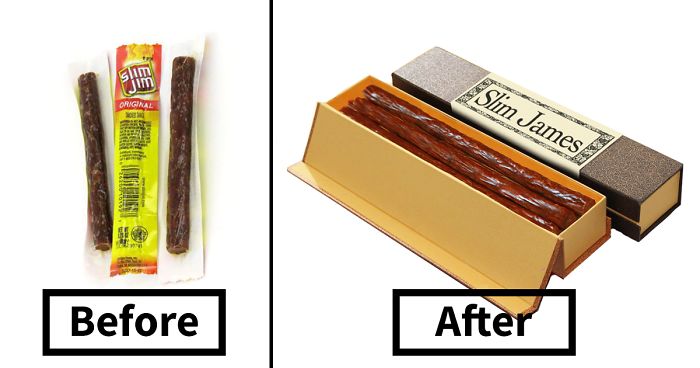
Slim Jim


I think the packaging on the left probably keeps them fresher, however packaging on right is fancy af
Twinkies

Fruit By The Foot

Cap’n Crunch

Hands off the Captain's Berries even if they are blue...
Load More Replies...I just realized the big difference in your packaging. Years ago (1953?) when "cold" cereal, packaged bread, individual snacks and such were first manufactured, it threw the new parents back into a childhood where these things never existed, and so therefore, the manufacturers had no problem selling them. When the novelty wore off, the packaging became predominantly aimed at the kids; bright colors, cartoonish characters, prizes in the boxes, sugar (no, REALLY, sugar) on the flakes, etc. After about ten years or so, that novelty wore off, and ran right smack into the nutritionists, who said that sugar was no good, and cartoon characters confused the kids into thinking that cereal was supposed to be FUN! Well we ALL know now that to eat a bowl of cereal, you have to check the contents first.....wheat? (Nah...celiac), corn? (Nah...GMO's) honey (Nah...bees are dying), dates? (Are we still in communication with their country?).....well, you get it. So parents, back to you.....
You can't market a serial with a boring box. No one would ever see it. Not even the "hipsters"
The label design, definitely, but not the box. Maybe in a rustic pottery jar, with this labeling.
Nerds

Yes, but here is a VITAL question, in the packaging on the right, are they separated by color? Because the ingenious design of the one on the left is that you can open the sides to eat the colors individually, or if you like to live dangerously, you can mix them
Four Loko

Dunkaroos


You could also say that by having a more unique/special packaging people will take more time to actually properly taste and enjoy these snacks and thus increasing their value. What I would also find interesting is a post where we would repackage expensive food/drinks as junk food like caviar or old whiskey's in a basic can.
Soon everyone will be buying the fancier packaged versions and the hipsters will want the junky looking packaging, it's a cycle
Hipsters will buy/do anything so long as no one else is. Once they find out there are more than 10 people interested in a topic, they lose interest. One way to give a hipster a heart attack is to mention that you've heard of the band/food/store they're talking about. They'll flip out!
I once read a study where a bunch of researchers quizzed hipsters on completely nonexistent bands, and the hipsters all pretended to know about them...
I think I saw something similar too, it was done at a big music festival, and the interviewer was pretending that this and that non-existent band was playing too.
Load More Replies...Absolutely dead on with this. Nailed it. Only thing is, hipsters have mostly morphed into yupsters. They're the ones with all the cash, stupid enough to drop $20 on an "artisanal" Slim "James" or Captain Crunch box. They are EVERYWHERE in my city. I know plenty of them. Fools will gladly pay $14 for something that is $3 a couple doors down just... because. Idiots.
So basically, just put it in a cigar box? Pretty. I love pretty boxes and have bought a few things just to get the packaging.
that, as far as I know it isn't necessary hipster to enjoy things in pretty packaging, but then again, things like healthy foods or enjoying old music also are hipster nowadays so yeah. its just like how you can buy for example a cheap version of alice in wonderland just for the story or buy one of those beautiful alice in wonderland books that are bound in leather and are way more expensive, it is the same but some just enjoy having it look more pleasing to the eye and there is nothing wrong with that
Load More Replies...I've always thought that marketing/advertising would be such a difficult job, this person has it!
Having had a heart Attack and 5 times bypass covering 14 blockages I wouldn't eat any of that c**p but I wouldn't say that I got there from eating that stuff because I never did.
The hipster jokes just keep getting funnier and funnier, right??? Zzzzzzzzzzzzzzzzzzzzzz
If I'm honest. I world by some of theses, first of most of the small area delicious . Second the packaging helps
There's a cereal fast food kiosk by the Barclay Center in Brooklyn. Combining different cereals is a hit.
I don't really understand the hipster movement. Is it just fashion and style, or is there an ideology behind it, like the punk scene? It seems like so many people in my age group dress like hipsters. Im not in any way passing judgement, just looking for clarification.
in theory it is something like wanting to be unique I think, but by wanting to be unique with a big group it gets mainstream, but well, I think I can be classified as hipster, I love vintage and weird bands and love it when food looks pretty and stupid weird drinks etc, but I have been like that my entire life, but the thing is that hipsters would just do it to seem interesting I think. I actually don't know, I just know that I like most of the hipster trends but not ironically or whatever, I do like how there are way more thrift stores and vintage stores now because you can sometimes find amazing things there and it is slightly better for the environment (to reuse things)
Load More Replies...people have been using French names to make things sound more interesting for decades, think of croissants or Jus d' orange (orange juice, or do only dutch people also use the french name idk) and all kinds of ballet words. As a kid I called my "special" tosti a Tosti a la Meeuw, for no other reason than how I thought it sounded cool
Load More Replies...only one I like is the Four Loko one, to be honest I have degree in both design and marketing, I would say that what the artist did is called rebrand and also repositioning, and some of the 'repackaging' seems dont know ... old? and tradition? I know this supposed to be minumal eco stuff but there's something which I dont know what maybe becoz I see the original product thats why it is a bit off but judging from the package alone then good job ... though this become more popular and boring I am talking about the bround paper thing
What else would it be? These images have really been made by a real artist with real Photoshop skills
Load More Replies...You could also say that by having a more unique/special packaging people will take more time to actually properly taste and enjoy these snacks and thus increasing their value. What I would also find interesting is a post where we would repackage expensive food/drinks as junk food like caviar or old whiskey's in a basic can.
Soon everyone will be buying the fancier packaged versions and the hipsters will want the junky looking packaging, it's a cycle
Hipsters will buy/do anything so long as no one else is. Once they find out there are more than 10 people interested in a topic, they lose interest. One way to give a hipster a heart attack is to mention that you've heard of the band/food/store they're talking about. They'll flip out!
I once read a study where a bunch of researchers quizzed hipsters on completely nonexistent bands, and the hipsters all pretended to know about them...
I think I saw something similar too, it was done at a big music festival, and the interviewer was pretending that this and that non-existent band was playing too.
Load More Replies...Absolutely dead on with this. Nailed it. Only thing is, hipsters have mostly morphed into yupsters. They're the ones with all the cash, stupid enough to drop $20 on an "artisanal" Slim "James" or Captain Crunch box. They are EVERYWHERE in my city. I know plenty of them. Fools will gladly pay $14 for something that is $3 a couple doors down just... because. Idiots.
So basically, just put it in a cigar box? Pretty. I love pretty boxes and have bought a few things just to get the packaging.
that, as far as I know it isn't necessary hipster to enjoy things in pretty packaging, but then again, things like healthy foods or enjoying old music also are hipster nowadays so yeah. its just like how you can buy for example a cheap version of alice in wonderland just for the story or buy one of those beautiful alice in wonderland books that are bound in leather and are way more expensive, it is the same but some just enjoy having it look more pleasing to the eye and there is nothing wrong with that
Load More Replies...I've always thought that marketing/advertising would be such a difficult job, this person has it!
Having had a heart Attack and 5 times bypass covering 14 blockages I wouldn't eat any of that c**p but I wouldn't say that I got there from eating that stuff because I never did.
The hipster jokes just keep getting funnier and funnier, right??? Zzzzzzzzzzzzzzzzzzzzzz
If I'm honest. I world by some of theses, first of most of the small area delicious . Second the packaging helps
There's a cereal fast food kiosk by the Barclay Center in Brooklyn. Combining different cereals is a hit.
I don't really understand the hipster movement. Is it just fashion and style, or is there an ideology behind it, like the punk scene? It seems like so many people in my age group dress like hipsters. Im not in any way passing judgement, just looking for clarification.
in theory it is something like wanting to be unique I think, but by wanting to be unique with a big group it gets mainstream, but well, I think I can be classified as hipster, I love vintage and weird bands and love it when food looks pretty and stupid weird drinks etc, but I have been like that my entire life, but the thing is that hipsters would just do it to seem interesting I think. I actually don't know, I just know that I like most of the hipster trends but not ironically or whatever, I do like how there are way more thrift stores and vintage stores now because you can sometimes find amazing things there and it is slightly better for the environment (to reuse things)
Load More Replies...people have been using French names to make things sound more interesting for decades, think of croissants or Jus d' orange (orange juice, or do only dutch people also use the french name idk) and all kinds of ballet words. As a kid I called my "special" tosti a Tosti a la Meeuw, for no other reason than how I thought it sounded cool
Load More Replies...only one I like is the Four Loko one, to be honest I have degree in both design and marketing, I would say that what the artist did is called rebrand and also repositioning, and some of the 'repackaging' seems dont know ... old? and tradition? I know this supposed to be minumal eco stuff but there's something which I dont know what maybe becoz I see the original product thats why it is a bit off but judging from the package alone then good job ... though this become more popular and boring I am talking about the bround paper thing
What else would it be? These images have really been made by a real artist with real Photoshop skills
Load More Replies...