Visualization can be applied to pretty much any field; it helps to tell stories by curating data into a form that's easier to understand, highlighting any trends and outliers. And there's no place on the internet that is as obsessed with it as r/DataIsBeautiful.
The subreddit runs on a simple mission: to collect visualizations that effectively convey information. But the way its 16 million members go about it is anything but. There are no fake numbers, goofball statistics, and trivial analysis—just legitimate facts, portrayed in aesthetically pleasing ways. Such a delicate balance.
We at Bored Panda have already covered it once but when a community is that big, you know it's gonna keep delivering quality content so we just had to make an update. Enjoy!
This post may include affiliate links.
Symptomatic Breakthrough Covid-19 Infections


World Elevation Map, Including Bathymetry (Ocean Floor)
")
One of the subreddit's moderators, u/PHealthy, took some time out of their day to tell Bored Panda about the latest r/DataIsBeautiful news. "Obviously, these days COVID is a very popular topic, and [our posts] frequently make r/all but really anything topical/trending tends to do well," they explained.
"So for instance, a Nobel prize or school shooting post would probably do well. But a soundly made novel DataViz always tends to do well, e.g. Tyler's recent post. But meta posts can do very well, too. So really it's all about balancing DataViz presentation with the topic being relatable, all the better if it's Reddit-related."
The Massive Decrease In Worldwide Infant Mortality From 1950 To 2020 Is Perhaps One Of Humanity's Greatest Achievements

If you're white in the U.S., your infant mortality rate is 4.8. If you're Black in the U.S., your infant mortality rate is 10.8. Racism in healthcare is real, and not enough people know that.
There Are More Cows Than People In The States Colored Blue

Let's pause and think for a moment. 16 million people is a huge audience. (And I'm not even talking about making it to Reddit's front page). One that many publishers would be proud of. Reaching such a number with just organic growth is proof that people really value r/DataIsBeautiful.
As my colleague Jonas pointed out in his text, the moderator team is purposefully left as a small group of professionals who focus on data visualization at some part of their lives.
Plus, the subreddit treats its original content creators as "first-class citizens," constantly engaging them and making sure they're credited and acknowledged for their work. As always, we provide a link to each post that we feature as well (you can find it under the pictures), so if you're interested in some particular visualization, follow it to its roots — there's usually an interesting discussion in the comments, too.
"We bring a data-centric view of the world to millions of people every day—from important information about the COVID-19 pandemic all the way to a random dude's daily bowel movements—and our community prides itself in that fact. For example, we had community members posting analyses and projections of COVID-19 trends back in January and February 2020—well before anyone in the U.S. was taking the pandemic seriously. r/DataIsBeautiful is THE place to go when you want to see the signal through the noise of hectic daily life,” one of the moderators explained in the earlier Bored Panda piece.
Countries With A Higher Life Expectancy Than The United States (World Health Organization 2019)
")
Notice that the countries with a higher life expectancy all have universal health care and the US does not.
This Map Shows All Of The Earthquakes With A Magnitude Greater Than 5.0 Over The Last 20 Years

Digital Elevation Model Of Greece

We're not just islands and sea! We also have beautiful mountains! It's a quite diverse country :)
Even with so many members, u/PHealthy believes that r/DataIsBeautiful retains a certain character, "unique to this corner of Reddit in regards to churning out decent DataViz posts. Of course, the creators take center stage with their amazing original content but (not to pat my own back) fairly strict moderation is a big part of keeping the community unique and also keeps the sub from turning into just another garbage re-posting karma farm like a lot of subs on Reddit."
The human brain processes visual information better than it processes text — so the charts, graphs, and other elements found on r/DataIsBeautiful can be very powerful — you understand exactly what they're telling you. Something tells me this isn't the last time we'll feature this awesome subreddit.
The 2020 Election If Only People Under 45 Voted

This means there should be hope for the future…and by this I mean a future without Trump in it.
The Highest-Grossing Media Franchises Of All Time

Each Vertical Band Contains 1% Of The Earth's Population

English Alphabet Organised By Each Letter's Note In Abc Song

I find it rather ironic that only the "G" corosponds to its note. The rest of them is sung on a different note than the letter says.
Average Yearly Sunshine Hours Of Germany

Who Makes More: Teachers Or Cops?

Fascinating! The areas with the better paid teachers (comparatively) have some of the lowest graduation rates... They also have some of the highest police brutality rates.
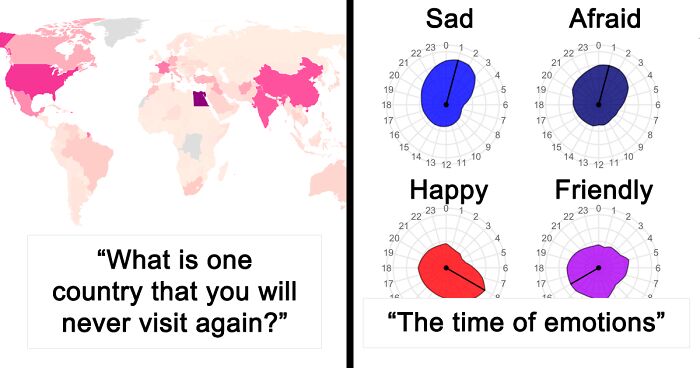
Google Searches For Different Emotions During Each Hour Of The Day And Night

Ugh, morning people aren't only annoying, they're happy about it, too?!
"What Is One Country That You Will Never Visit Again?" Answers From R/Askreddit

This is somewhat misleading, as the very worst countries are ones no one visited in the first place.
World Leaders By Age

Comparing Emissions Sources - How To Shrink Your Carbon Footprint More Effectively

35% Of "Entry-Level" Jobs On Linkedin Require 3+ Years Of Experience

It's fine if your job isn't an entry-level job, but then it shouldn't be paying entry-level wages.
Where Are The World's Airports? This Map Shows Locations Of The Worlds Airports And Heliports

This map doesn't check out. There are not this many designated airports in the US, and some countries that aren't very populous are showing dense airport locations. While it's true that many aircraft can land outside airports, the spots on this map is not showing where those places are ample. I don't believe this map, as someone studying US airport directory maps as a student pilot.
Where Can You Afford To Live On The Minimum Wage In The United States?

So, there is not one state in which you can afford to live on the minimum wage?
Knight Moves - A Simple Table I Made Showing The Importance Of Keeping Your Knights Near The Middle Of The Chessboard

I'm not a chess player, but why would you put your knight at the corner? Considering how it moves, corner is the worst place.


The Top 15 Countries (Apart From Sweden) In Which The People Who Currently Live In Sweden Were Born
 In Which The People Who Currently Live In Sweden Were Born")
California Is The World's 5th Largest Economy. Here Are The Top 5

Maps Showing Water Shortages During May Have Become Increasingly Extreme In California

Yearly Road Deaths Per Million People Across The US And The EU. This Calculation Includes Drivers, Passengers, And Pedestrians Who Died In Car, Motorcycle, Bus, And Bicycle Accidents. 2018-2019 Data

Now I know why other state licenses aren't valid in my *state* in the US.... (Or my home state... wow.... the bible belt is more like the car crash belt)
Load More Replies...The first thing that came to my mind is that Americans seems to drink and drive more. In Sweden we have practically zero tolerance to drinking and driving and at least on tv and in movies americans seems to have a few drinks and then drive home
Well. Sure, US drivers drive more and have less public transportation, but a big cause of (vehicle) death is not "mileage" but not wearing a seatbelt, drunk-driving and speeding. https://www.cdc.gov/vitalsigns/motor-vehicle-safety/index.html Especially the lack of wearing your seatbelt is astonishingly high in the US compared to other countries.
I've noticed in the past reading peoples stories from the U.S. that a family member had died in a traffic accident, and wondered thought it strangely common. Why is it so bad over there? It's not as if the speed limits are particularly high, and they have a lot of Police.
A number of factors: Road conditions are worse. People have to drive more because of the infrastructure. The infrastructure is aimed at handling vast amounts of cars instead of safety. There is no separation between different types of traffic. Bicyclists share their space with cars, HGV's and motorcycles. Some states have little to no checks on car safety or road worthiness.
Load More Replies...Why on earth the "less than 40 deaths" is darker green than the "more than 40"? That's so confusing!
I'm Not sure about the validity of this one, they are missing the UK data and the UK didn't leave the EU until Jan 2020. I don't think it would make much difference to the overall view but but it's still missing data.
Wait, I forgot they left the EU...
So, none at all in England Scotland or Wales ?
Not at part of the EU (anymore), which is what the map depicts. You will (ought to) also notice that Norway is missing on the map as they are not in the EU either.
Load More Replies...I wonder if the US states that are dark gray have more fatalities because more people there don't use seat belts?
Interesting that vehicle insurance is mandatory in the U.S., but not other countries noted here.1
There were 33,244 fatal motor vehicle crashes in the United States in 2019 in which 36,096 deaths occurred. This resulted in 11.0 deaths per 100,000 people and 1.11 deaths per 100 million miles traveled. The fatality rate per 100,000 people ranged from 3.3 in the District of Columbia to 25.4 in Wyoming.
This map is so totally misleading. It should be listed by number of miles driven. "The average miles driven per year by Americans has now reached a total of 14,300 miles. That sum would cover almost three round trips between Los Angeles and New York. As a collective, American drivers cover 3.2 trillion miles each year, enough to take nearly 5,000 trips to the moon and back."
Miles driven would/could be just as misleading. Road trips for example accumulate a lot of miles, but relatively little risk because most accidents happen where traffic is thick (cities), not as much in between places. Might as well argue that European drivers don't have nearly as much practice/experience. Other important factors are road and car conditions, traffic regulations and how strictly they are enforced/obeyed and how much effort is put in educating future drivers (drivers licenses in Germany take a lot of theoretical and practical lessons before anyone is allowed to take the tests, making the document quite expensive - at present starting at about 3000 €)
Load More Replies...We have no speed Limit on the Autobahn, in US you're only allowed to drive 55 mph. Perhapy they should start driving faster @_@
Numbers are lower in NJ because we don’t have enough room to get up to a decent speed before impact.
This is kinda misleading if you are supposed to compare US vs EU. Not nearly as many people drive in the EU whereas in the US we have to drive as most places are to spread out and/or public transportation is just not a real option. In most families there is at least one car, usually 2-3 cars if they are a two adult house and have teenagers. In the EU most people do not own a car much less 2-3. The only cities in the US where you wont find as many car owners is in N. Y city, Boston, Chicago proper, and philly ( I might be missing one 🤔) because they do have a transit system. There is also the price of gas. What we pay in the US for a gallon they pay for in PINTS. Not many people in the UK are willing to pay that much for gas if they can walk, bike or use public transportation with relative ease
Most families in the UK own a car, or two. Only in larger cities do people not bother and use public transport instead, and our public transport is not as reliable or value for money as some of our European neighbours.
Load More Replies...This is so sad, but people should see these facts. There are accidents every day on my way to work regardless of my drive. From Philadelphia or from Pottstown. On the turnpike or 422, on 95 or 76.
Meaningless statistics. What's the rate per mile, or other unit of distance, traveled? This map is just nonsense.
Looks about right. At a 4-way stop intersection near where I live in North Carolina, the drivers all act like they throw dice and the highest roll goes first. Meanwhile, in Europe, they simply use roundabouts instead.
Yay Utah!!! We have been taking a beating on this list. At least we are not leading the way road deaths!
Aaah! This map is doing my head in. No Britain means the Ireland koala doesn’t have a face. Stupid brexit.
Wonder if this includes MV vs Cow/Deer/Moose? Which would account for US states with more wildlife than traffic.
How is this happening in Montana? Their population is tiny and their land area is huge, giving them fewer than 7 people per square mile of land.
Capitol Insurrection Arrests Per Million People By State

Wordcloud Of Angela Merkel From Her Speeches Of Last 4 Years

If All 533 Million Compromised Facebook Accounts Were A Country

What If You Bought $100 Worth Of X A Year Ago?

Movies With The Greatest Difference Between Rotten Tomatoes Critic And Audience Ratings

I'm pretty sure that Captain Marvel was review bombed before the movie was even released, which explains the audience rating....
Note: this post originally had 47 images. It’s been shortened to the top 30 images based on user votes.


I hope the next generation or rather the current generation would make decisions based on data, rather than how they "feel". Especially the ones that would have major impact in their lives. A lot of times, how you feel does not really reflect reality. This is why marketing and political campaigns work.
I hope the next generation or rather the current generation would make decisions based on data, rather than how they "feel". Especially the ones that would have major impact in their lives. A lot of times, how you feel does not really reflect reality. This is why marketing and political campaigns work.
