224Kviews
40 Interesting Charts People Shared On This Group That Might Change Your Perspective On Things
InterviewData is beautiful—and I’m in love. I swear it’s not just because of its gorgeous pie charts, voluptuous curves, and stunning axes... Promise! When it comes to showing off just how stunningly data can be presented, there’s no better to place to feast your eyes than the ‘Data is Beautiful’ subreddit that hosts a massive community of over 15.6 million people and which celebrated its 9th birthday in February.
The community is full of math, statistics, and art lovers, as well as professionals who use data every day. Often, they get so inspired by the eye-pleasing charts and graphs, they create their own and end up on the front page of Reddit.
We’ve collected some of the most aesthetic expressions of data found on r/DataIsBeautiful for you to enjoy, so scroll on down and have a peek, dear Pandas. As you dive deep into the world of stats, upvote the images that you liked the most. Remember, the charts love it when the numbers go up. (Pssst, the subreddit even has its own Twitter page and Discord server.)
I had a lovely chat with some of the moderators running the ‘Data is Beautiful’ community, including redditors NotABotStill and PHealthy. So be sure to read on for the in-depth insights they shared with Bored Panda about the ins and outs of how the small team of professionals manages the massive community of content creators. They’re a very friendly bunch, so you shouldn’t hesitate to join the community if you’re into charts, graphs, maps, or, well… simply love looking at pretty pictures.
More info: Reddit | Twitter | Discord
This post may include affiliate links.
A Year Ago I Was Hospitalized For A Failed Suicide Attempt, I Decided Then, That I Wanted To Be Healthier And Happier; This Is What A Year Of Therapy And Proper Medication Can Do. Don’t Give Up


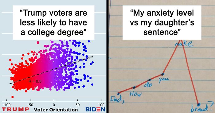
My Anxiety Level vs. My Daughters Sentence

Despite having millions and millions of members, the subreddit still maintains some of the core tenets that they had when it was still founded. The moderator team is purposefully left as a small group of professionals who focus on data visualization as some part of their careers and lives. That passion for data translates into passion for the r/DataIsBeautiful community.
What’s more, the subreddit treats its original content creators as “first-class citizens,” constantly engaging them, and making sure they’re credited and acknowledged for their work (as all creators should be!).
“We bring a data-centric view of the world to millions of people every day—from important information about the COVID-19 pandemic all the way to a random dude's daily bowel movements—and our community prides itself in that fact. For example, we had community members posting analyses and projections of COVID-19 trends back in January and February 2020—well before anyone in the U.S. was taking the pandemic seriously. /r/DataIsBeautiful is THE place to go when you want to see the signal through the noise of hectic daily life,” one of the moderators explained why the community is so loved and popular.
People Killed In Terrorist Attacks In 2017: Europe (Blue) vs. Africa (Red)
 vs. Africa (Red)")
6 people dead in the USA = World news.... 200+ school children kidnapped from a school every other week in nigeria and it's hardly a blip in the news. I wonder if people know that there have been 4 mass kidnapping in nigeria this year alone... at one school, they took 317 girls
Things that happen every day don't make the news, because, in fact, it's nothing new, no matter how horrible the situation. But I do agree these things need to be addressed more and be taken care of. Change takes time, though. In the meantime, innocent people have to suffer.... u.u
Load More Replies...We live mostly within our own cocoons. It is painful and scary and sometimes futile to look outside. If we look at the news around the world, we are all at once overwhelmed and feeling small against the tidal waves of violence, ignorance, and waste. Thank you for opening some eyes.
If you add Asia as well it'll further increase the red ones yet our people never get mourned or have hashtags made for them. We're only mentioned when Americans want to refer to us as backward and inferior to them yet we've lost more lives due to terrorism than the US and Europe combined.
Asia would need a separate color though. Besides, that doesn’t change this chart and statistically Africa is still more dangerous.
Load More Replies...I remember the world having a fit at the bombings in Paris against that cartoon company, the same week 87 girls were taken by the Boko Haram, they still haven't been rescued because nato didn't want to risk their lives saving a bunch of school girls. To this day they know their locations and won't lift a finger to help.
Media is driven by agenda not statistics. It is why Americans could care less about the 6000 blacks being murdered every year but are willing to protest for a few killed by police.
I get wrong vibes from this one,a victim is a victim.I get it that news will cover Europe more than Africa but still...
To be honest, being an European myself, I'm more interested in attacks in Europe than in those in Africa - it's just more relatable. Also, Europe, at least when it comes to its western and central part, generally has stable situation - no war, no bigger conflicts. At the same time quite a big part of Africa suffers from bigger or smaller armed conflicts. Given this situation, of course attacks and victims in Europe are more covered in media, because they're less expected, therefore more shocking for general TV viewer. .
Naturally, for the same reasons, I take more interest in what happens in Europe as well. However, when I realise how Africa isn't very far from Europe, these things start worrying me too. Specifically, I'm talking about the Mediterranean.
Load More Replies...We NEED to take this to the news. Absolutly no body knows about it! Maybe is the sociaty was more aware, there would be more pressure for the governemts to do something about it. Tha is insane! Such tragedies and no one sees them!
"Let's practice motivation and love, not discrimination and hate." \^o^/
These remarks about us don't me surprise anymore sadly. I actually expected one or two of these before i read the comments so you didn't disappoint but still very hurtful
Load More Replies...I Finished My Year Long Temperature Blanket!

The amount of posts and comments that the mods of r/DataIsBeautiful have to deal with is absolutely staggering. I’m not exaggerating when I say that my jaw dropped when I heard about it. The subreddit gets roughly 400-500 submissions each week and has had 2,370 approvals, removals, and spam posts over the last month alone.
Meanwhile, the number of comments they get is beyond counting, but the mods estimate that the number ranges in the tens of thousands and might even be as high as over a hundred thousand.
President Trump False Or Misleading Claims While In Office

Us Elevation Tiles

Colorado represent! I grew up there. It wasn't until I moved away that I realized people elsewhere don't usually know what elevation they're living at.
Redditor NotABotStill has been a moderator at r/DataIsBeautiful for two years and revealed to Bored Panda that the mod team is global, with members living in the EU, US, and APAC, so that they can cover all the time zones.
The level of professionalism that they have is pleasantly surprising. However, that makes sense once you realize that they’re actually all professionals in their personal lives and are a very close-knit group who regularly communicate. You can expect this level of dedication from people running a successful company.
“We certainly refine the rules over time. For example, we no longer allow YouTube videos as it was being abused by content creators looking for subs on their channel. We also occasionally temporarily prohibit specific subjects, like Tinder or dating posts, when a topic overwhelms the subreddit although dating posts are allowed again,” moderator NotABotStill explained.
What Percent Of Social Media Content Are Ads?

I Ran A Quick Poll Last Week On Digital Transformation

“We also only allow personal posts (posts about the poster such as miles jogged over a year as an example) on Mondays which I believe we instituted during my tenure. That's just a flavor of the types of rules we add, adjust, or remove over time. Rule changes are done by consensus of the mods and we will often spend days or weeks deciding on new rules and how to word them,” they said that they’re always moving towards perfection, with a lot of time spent on making the subreddit better and better.
The moderators manually approve or remove each and every post, but they mostly rely on their fellow redditors to report posts and comments that violate their rules of conduct. They also use AutoMod to help move the process along. Posts that go against the rules end up being automatically removed, so the mods can spend more time on important issues rather than chores.
Searches For International Men's Day Peak Every International Women's Day

Trump Voters Are Less Likely To Have A College Degree

“Most posts are visible immediately, however, we also utilize AutoMod to ‘filter’ out posts that likely violate a rule. Speaking of AutoMod, we heavily rely on it to filter, or make invisible, both posts and comments based on keywords, user karma, and URL links (to name a few) which then have to be manually approved before they are visible. We also utilize it to automatically remove posts that violate our rules (e.g., YouTube links or directly linking an image and not claiming [OC]) so we mods don't even have to see them.”
NotABotStill pointed out to us that popular posts on the subreddit “are often approved multiple times” because they’re reported while some posters end up reposting the images because the AutoMod catches the [OC] error. That means that the number of original monthly posts is probably closer to 1,500 to 2,000, once you do away with the reposts and multiple approvals.
Paths Of 800 Unmanned Bicycles Being Pushed Until They Fall Over

Selected Leaders During The Queens Reign (Up To Now)
")
Moderator NotABotStill explained that they rely on the users to upvote and downvote submissions and don’t make subjective evaluations about how each one is or isn’t aesthetic. In other words, what the community thinks is incredibly important.
When asked, the mod said that they wouldn’t be able to choose between which they like more, pie charts or bar graphs, and would prefer “a simple Excel line chart any day over those two.” (Personally, I know I should prefer bar graphs, but my heart belongs to pie charts.)
My Experience Of Trying To Find A Job As A Pilot In The Last Four Months

Area Of Land Burnt In Australia And Area Of Smoke Coverage Shown As Equivalent Area Over Europe

Meanwhile, moderator PHealthy highlighted that the subreddit has had “fairly linear growth” since being founded in 2012. The growth started to slow down in 2017 and 2018, however, the sub is still adding thousands of new members each day. “That said, with the way Reddit works the subscriber count isn't all that important above a certain point which is enough to it r/all and/or the front page. That hits on a topic most of the more serious subreddits face: good content vs popular content.”
PHealthy said that moderating the community is a team effort. However, some mods go “above and beyond and really keep the community moving” where the automated mod tools end up not being enough. “I moderate a few other large communities so I split a lot of my time and try to help with the modqueue as much as I can but really only go after the real egregious offenses like hate speech, racism, personal attacks, etc.”
Two Thousand Years Of Global Temperatures In Twenty Seconds

Average Flag Colour By Latitude

The moderator added that the number of submissions can vary depending on what’s happening around the globe at the time. “COVID for instance gets a big spike as well as popular post copycats.”
In PHealthy’s opinion, animated graphs are rarely better than something like a grouped bar graph, even though they certainly draw the eye. “Pies and bars certainly both have their uses but we've all seen the results of tortured dataviz and I think that's where something like the pie chart gets a bad rap.”
Passenger Fatalities Per Billion Passenger Miles

Causes Of Financial Loss In The USA, 2011

The moderators of ‘Data is Beautiful’ also went in-depth around what kind of content they consider to be good, what visualizations are popular, and what falls into both categories (if this were a Venn diagram, the latter would be the part where the two circles intersect).
Here are two examples of top posts in the last month that “look good and engage the audience to change over time on a popular subject” right here and here. Meanwhile, images like this one and this one might be popular because of the subject matter and what Redditors prefer, however, they’re “awful” and “difficult to read.”
Finally, here’s an example of great data visualization that, unfortunately, doesn’t do great because the subject matter doesn’t appeal to the audience or it’s too technical.
Most Popular Web Browsers Between 1995 And 2019

Never even heard of Netscape. For me I have found Opera and Google chrome to be the best. And I hate Firefox.
My Wife Made This Blanket That Indicates A Certain Temperature For Every Day Of The Year. 2016 Pennsylvania

The ‘Data is Beautiful’ subreddit is about finding the perfect blend of beauty and brains. Or about the best way to present any particular dataset if you look at things from a different perspective. The subreddit is here to share and discuss all the various visual representations of data. From graphs and charts to, yes, even maps!
Another moderator who’s had 7 years of experience working with r/DataIsBeautiful explained that “back in the early days,” they were a niche community focused on attracting data visualization researchers and professionals. With the occasional enthusiast dropping by, too, of course! Eventually, with the growth of the community thanks in large part to a cordial relationship with the Reddit administrators, the subreddit grew to encompass a much broader range of members.
Lyrical Composition Of Daft Punk's 'Around The World'

Public Opinion Of Same-Sex Relations In The United States


“Most of our discussions back then focused on critiques and improvements of the data visualizations themselves, a focus that still sits at the core of the community to this day,” the moderator shared what the start of the community was like.
“In February 2012, the Reddit admins and DIB mods agreed to make /r/DataIsBeautiful a default subreddit. That meant that every new Reddit user would automatically be subscribed to DIB and our top content would consistently show up on the Reddit front page. After that point, our community grew extremely fast and continued growing even when the default subreddits were abolished in mid-2017,” they shared one of the reasons why the sub grew as fast and as big as it did.
Us College Tuition & Fees vs. Overall Inflation

They got no justification for the prices they charge. Just a money making scheme.
The States In Blue Have A Combined Total Population Equal To Los Angeles County, In Red

It really isn’t just about the pretty pictures, however. Anyone who wants to dig a little deeper and learn a bit more about how to visualize data well can do so. “We provide a handful of guides for folks just learning to create data visualizations, and we require every original content post to include at least a brief description of the data source and how the data visualization was created so folks can learn from that. DIB is a great place to learn the craft of data visualization by doing,” the moderator shared with Bored Panda.
2020 Electoral Map If Only ____ Voted. Breakdown By Each Major Demographics

Donald Trump's Tweet Announcing His Covid-19 Diagnosis Is, By Far, His Most Liked Tweet Since Becoming Us President

“DataIsBeautiful is for visualizations that effectively convey information. Aesthetics are an important part of information visualization, but pretty pictures are not the sole aim of this subreddit,” the subreddit explains what it’s all about.
Now, pretty graphs might not be the entire story, but they can sure help express data in a way that grabs (and holds!) your attention, so you can understand the data better. Something that’s clear and stunning will help you remember it better. And if you understand something well, you can then use that data in arguments and (socially distanced) dinner parties.
Distribution Of Snickers Letters In My Halloween Candy

Tracking My Push-UPS In 2020. My New Year’s Resolution, Was To Do 100 Push-UPS In One Go. It Was A Slow Burn, Took Over 8 Months And 48 Attempts To Build Up My Strength And Stamina (Age 49)
")
As a whole, the community very much appreciates originality and creativity. They encourage people to post their own original content (it’s got that little OC sign next to in case you want to see what’s what). If there’s a graph that you love in particular, send the creator a warm ‘thank you’ to encourage them to keep on creating data eye-candy. And if you end up sharing it somewhere, be sure to credit it properly. It’s original content, after all!
Google Year In Search 2020 Top Search Terms

Attendance At Donald Trump’s Rally In Tulsa, Compared To The Number Of Tickets Trump Claimed Were Requested

So, dear Pandas, which chart or graph did you enjoy the most? Do you think that good data will always speak for itself or do we have to give it a gentle nudge to make it more palatable for our eyes and minds? Do you draw maps in your spare time just like I do? And, we’ve got to ask—do you prefer pie charts or bar graphs, dear Readers? Leave us a comment below!
Harry Potter Characters: Screen Time vs. Mentions In The Books

11 Different Brands Of Aa Batteries, Tested In Identical Flashlights

Of course the Duracell lasted longer. It is longer in size than the rest! I think the experiment was biased.


The Popularity Of The Name ‘Karen’ Has Seen A Dramatic Decrease Within The Last Ten Years

Cause Of Death - Reality vs. Google vs. Media

Berlin Subway Map Compared To Its Real Geography

Percent Of Air Per Bag Of Chips

Top 10 Highest Covid-19 Donations With The Percentage Of Their Net Worth

Blockbuster Video Us Store Locations Between 1986 And 2019

Would You Rather Be Hot Or Cold?

Neither, I would rather be warm. Even though I hate the cold at least you can keep putting layers on to warm up. Unlike the heat, there is only so much you can take off. Humidity is even worse.
States Kanye West Received Votes In

Note: this post originally had 150 images. It’s been shortened to the top 40 images based on user votes.


I like this a lot, but what I condemn is that sources are not directly given with the pictures, or, with easily shared pictures, even embedded into them. It is just to easy to forge such figures that are not based on facts that those based on facts shold make good examples!
There is a link to the source under almost every picture (Pro tip: It's all from https://www.reddit.com/r/dataisbeautiful) - or did you mean the original source?
Load More Replies...Because like 1/3 of bored panda are reddit aggregates. (Not really complaint; I would never have seen this otherwise)
Load More Replies...No. 12 is wrong, at least for germany. The chancellor is the equivalent to prime minister not the queen. You should list the federal presidents instead. The current one is Frank-Walter Steinmeier.
Some of them are really cool,other are a bit biased or misleading
