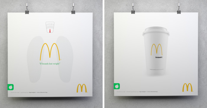
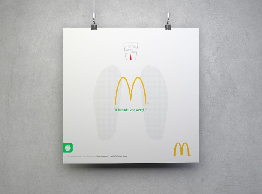
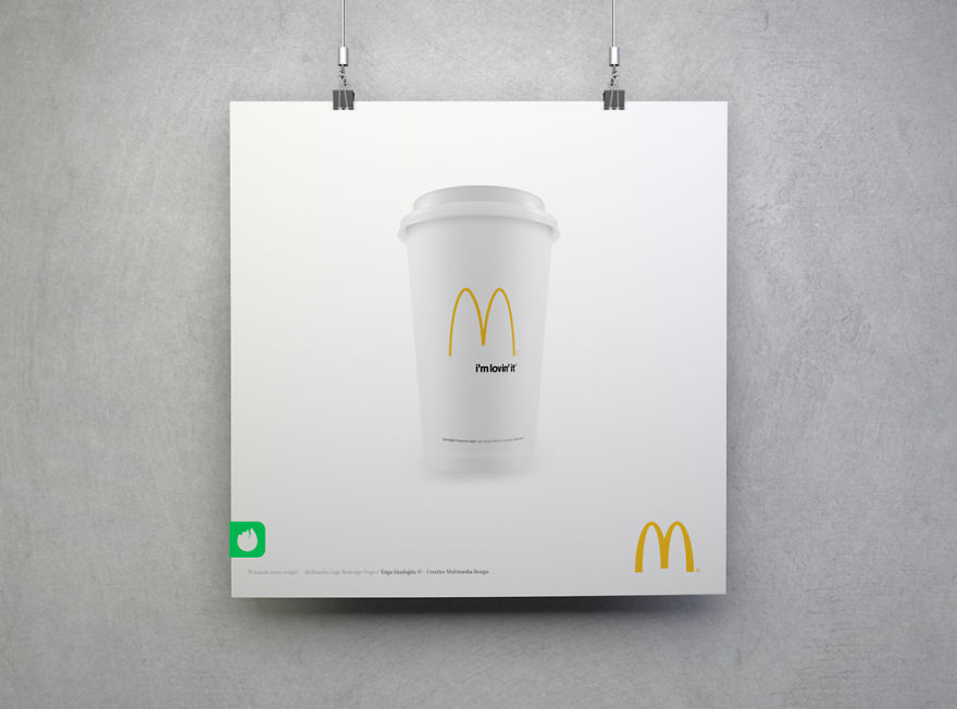
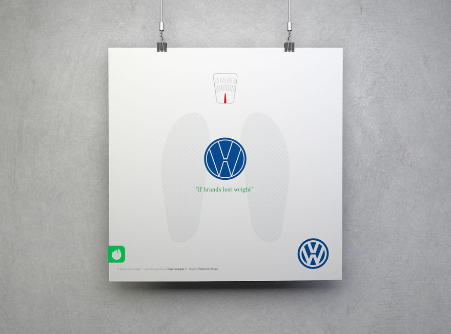
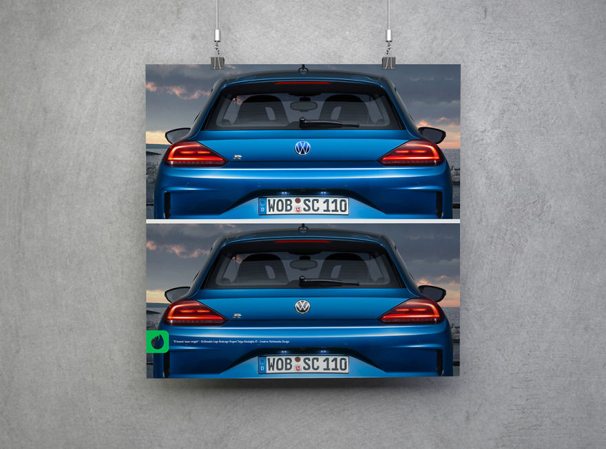
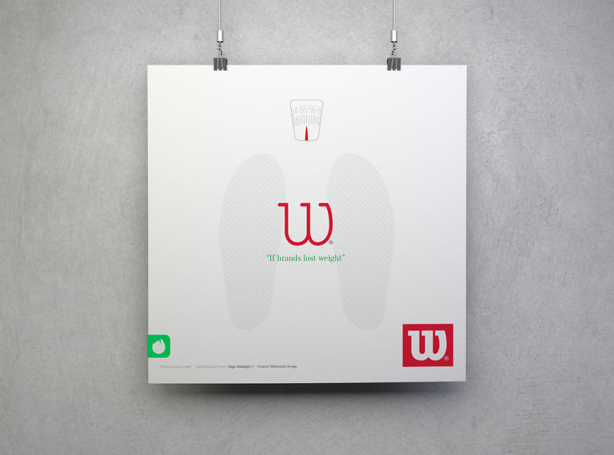
In this project I redesigned the most famous brands’ logos. “lost weight” means reducing logo’s line weight to make them appear slim and modern.
I designed this series to show the importance of line thickness. The project is still work in progress.
More info: tolgagundogdu.com
McDonalds
McDonalds
Volkswagen
Volkswagen
Wilson
Wilson
13Kviews
Share on FacebookI would get it if it was all fast food or something equally unhealthy. As is though I have no idea haha
Load More Replies...hmm..... interesting.... hmm... interesting... and what was the point?
I would get it if it was all fast food or something equally unhealthy. As is though I have no idea haha
Load More Replies...hmm..... interesting.... hmm... interesting... and what was the point?


20
11