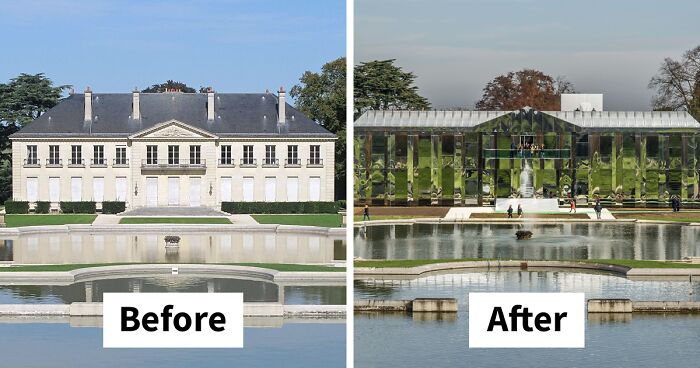
296Kviews
22 Times Buildings Were Renovated And Some Say They Now Look Worse Than They Were Before
Beauty is subjective, beauty is in the eye of the beholder—most of us were taught to never judge a book by its cover. Or, more simply put, to not be superficial. However, scientists argue that aesthetic appreciation of beauty is hard-wired into our brains—we can't escape it. Subconsciously or consciously, we all like to look at beautiful creatures, be it an animal, or a building.
Therefore, some people that are more leaning towards traditional architecture are worried that the notion of beauty in buildings is fading away. As cities all over the world are experiencing globalization, the newly designed buildings can sometimes look awfully alike, even if they were built thousands of miles apart. We're all familiar with the glass boxes in the prestigious areas of cities, that, according to some, are lacking that certain kind of charm, or je ne sais quoi, that makes them unique in their own way. But before we get all judgy, we want to let you decide what you think of these building renovations. Bored Panda has made you a list of before and after pictures of some buildings around the world that were renovated in a way that didn't sit right with some people. Do they look good to you? Scroll down below to see them all and tell us your opinion!
This post may include affiliate links.

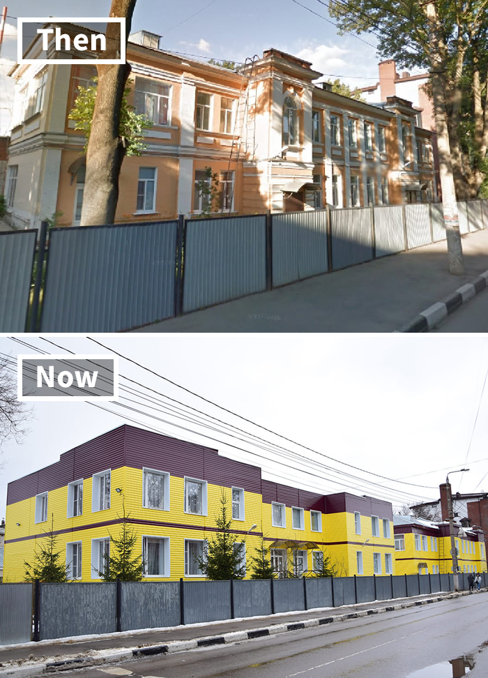
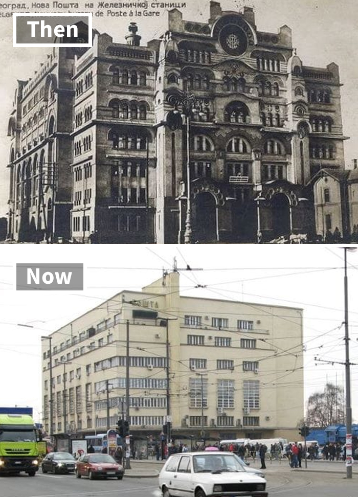
Also Russia, but this cladding just clips on so it could be removed and the oдвук building is still under there
Actually I like both of these. I think the angle of the second photo makes it look like that... But up close, it'll look magnificent, especially considering it's a public building.
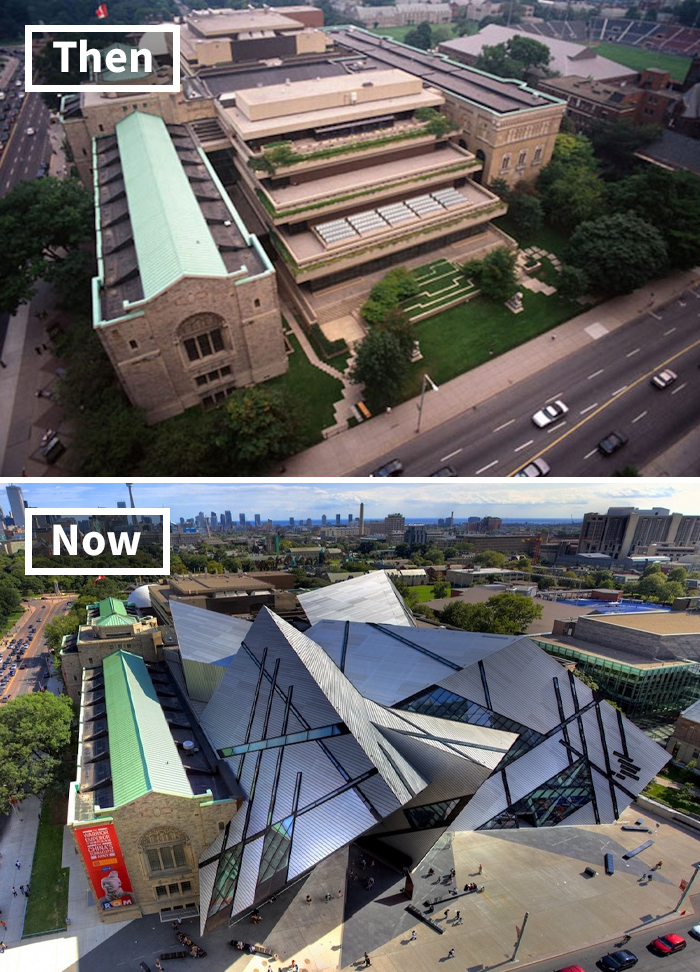
Load More Replies...I have been to the Royal Ontario Museum. Walking through the front entrance at street level, you don't realize that the building is encased in so much steel and glass. This aerial view makes it look painful. Otherwise, they have well curated exhibits there.
I always thought it looked like the building was throwing up onto the street. Close to Dundas Square, but feels out of place compared to the rest of the block. Definitely, instantly recognizable and agree on the well curated exhibits.
Load More Replies...It's the Royal Ontario Museum, and the old building was tiny by comparison, ugly, and bunker like. This is flat out gorgeous.
Load More Replies..."Let's make a GIANT abstract art painting!" "Nah. How about a BUILDING?"
Daniel Libeskind, right? A master architect. That silly office desk with drawers they had before is certainly worth less than the building they have now. This example does not belong here.
Why did the architect not have the manners to keep his roof from cutting over the old building? No respect.
If they're going to do this, they should have just gotten rid of the whole thing. Keeping part of the old with the new just looks stupid.
That's an architecture students' first year fantasy, how did it get built?
I do like the modern build, it's interesting, but why do they always leave that one chunk of the old building? It just looks so weird! I get sometimes, there are legal reasons for it, or they're "trying to preserve" the old building but it's just no....
This is actually The Royal Ontario Museum in Toronto. It's really cool and half of the building is the original and the other half is more "modern".
The Denver Art Museum annex is similar, designed by Gio Ponti. He has designed similar structures all over the world and EVERY ONE OF THEM IS A NIGHTMARE: poor interior navigation, leaky, difficult to heat and cool, and reflections onto neighboring buildings can be blinding.
So, they went from large terraces that would allow people to sit under the sun and even plant rather large container gardens to this monstrosity that just looks like a pile of broken glass—-hell, why didn’t they stain some of the glass red to look like the blood of the poor soul who had to clean up after the glass broke.
It's a museum, not a garden. This allows more space for exhibits, instead of planting asparagus. It also attracts more visitors.
Load More Replies...on the plus side, youll never get a ball stuck on the roof of that place.
For everyone saying that the second photo is better; it's actually a terrible design because inside there's all these weird jutting walls so the exhibits (it's a nature + history museum) had to be laid out to in very strange configurations to accomodate. Additionally in the original design, inside the bottom 'office drawer' was actually a full size reproduction of one of the terracotta tombs which had to be removed entirely when the crystal was added on to the building.
The old entranceway was \ is grand, gold mosaic tiled arched ceiling, balconies from the second floor overlooking the spacious area with its lovely marble floor. But they moved it to the 'crystal' where you can hardly find the right door, some drab small thing right off the street. From the street, this new addition looks like the back portion of a fat hen, and now you have to use the bird,'s back aperture as the entrance.
Hey that's the ROM! It's actually a pretty cool design. And inside, it's gorgeous.
Terrible; the original building was all beautiful marble and limestone and the new building is all metal walkways and white walls that got haphazardly shoved into the size of the old building (not to mention all the points on the outside match on the inside so there's a lot of weird, narrow triangular corners.)
Load More Replies...Even the grass and trees didn't want to stick around. And benches out in the sun, no shade -- it's a concrete wasteland. Hold up a magnifying glass and set me on fire!
Isn't this the design that Frank Gehry wadded up and threw away, but some underling fished it out of the trash. The corner was missing so that's why part of the original building was spared. Maybe from ground level you can't see how as a whole it does not come together. Taxi! Get me outta here!
me seeing then: ok ok cool me seeing now:QUÉ DIABLOS POR QUÉ HARÍAS QUÉ ESTABA BIEN ANTES
I bet the people renovating just went like " hey let's make the roof look like broken glass"
They took a nice building and said, "HeY lEtS mAkE It SpIkY!"
hot take but I actually kind of like the 2nd one :o minus all the concrete, though. They could've kept the green.
The middle section you see on the top photo, is not part of the old classical building. It was also added at some point, but it was badly designed, taking too much space without utilizing it. None of the old building is damaged, just partially incased in the new one. It added a lot more exhibiting space that was needed. This is a bad areal photo. It’s much nicer and interesting from the ground.
OK, so the original wasn't exactly pretty. The replacement, on the other hand, should come with a warning for people prone to seizures. Who signed off on the roof going across the façade of the church? Why?
TBH it looks pretty cool from street level, they kept the beautiful parts of the old building and incorporated the glass and metal to give quite a contrasting image.
that's the royal ontario museum. they expanded and it was designed by daniel libeskind. they kept the original entrance and the inside of the place is DAZZLING. not a fail at all.
OMG! The first pic was really cute! Why would ANYONE do such a thing?
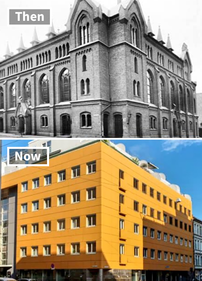
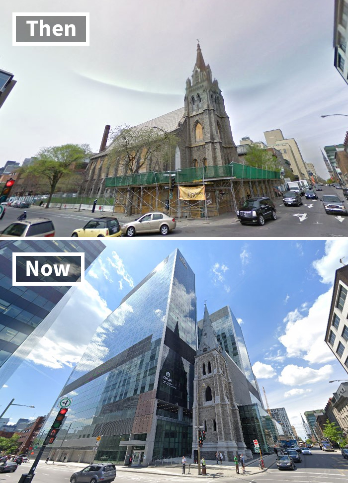
hey janice let's replace this beautiful building with a yellow block


This is a pretty lazy list - many of the original buildings were either bombed or cleared after WW2. In many instances the replacement buildings were put up quickly and cheaply, or were genuinely believed to be cutting edge in the '60's
Thank you for clarifying that. Usually in architecture you can see bones and remnants left from the original, but many of these were clearly different.
Load More Replies...I imagine that so many of the before buildings were in such bad condition that it was less expensive and safer to tear them down.
Every photo that shows a building destroyed in WW2 and what replaced it needs to be removed. Comparing what became a bombed out pile of rubble to a new building is bullshit.
If we were misled on even one of the photos it negates the entire premise of the post. Replaced is not renovated and if a major portion of the original building was destroyed and replaced with something else entirely that does not qualify as a renovation either.
Load More Replies...Many of these are not renovations but replacements. This "list" is no list. Totally useless.
The title of this post is so misleading 😠 Those are NOT renovations! Most of the pictures show what was in that spot decades ago and then what's there now. Given most of those are from Europe it's safe to say that "before" buildings no longer exist because of the bombings in WW2 or were torn down not much later due to damages.
A lot of the time, this is done because there's really no other choice. An old building is falling apart and otherwise unsafe/unusable as is. We don't t know the full stories, here. That said, turning something charming and comfortable into something Brutalist or Minimalist isn't usually a good idea. Especially when it's a result of gentrification driving out people in favor of new, wealthier, people.
i kinda like Brutalism... its so ugly and weird that its fascinating... its a part of history now, but I dont understand they thought it was a good idea back then.
Load More Replies...Most of these were either damaged or destroyed in WW2, or the original structure was unstable after being abandoned for years. Now, if you want something gross that doesn't come under these conditions - Maidstone Museum, listed old mansion house that they cut a hole in and slapped a burning gold and glass structure on the side of. maidstone-...f1baca.jpg 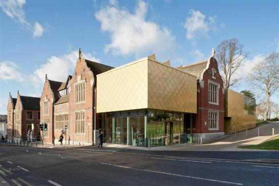
I don't know any historcial facts or storys behind these bulidings, but people shuld take a look back and appericate the buliding thats aleready there.
A lot of the old buildings got bombed so that's a valid reason to replace them with was considered modern architecture. Sadly even today beautiful buildings get destroyed because a council wants to "step into the future" by building ghastly concrete towers. That's why a lot of cities are so terrible depressing. Grey pavement, grey buildings, black tarmac.
Sad. Before old building look beautiful and interesting. Lazy after new build. I hate new build like modern buildings. I like vintage and cozy old things.
"renovation" is not building from the foundation on the remains of last building but renewing or "making something look new again". Half of those are not "renovations".
Let me just point out that not every building survives hundreds of years intact and very often they need to be demolished, and sometimes it happens that during wars buidings (and not just buildings) are destroyed. In those cases, noone creates an exact replica of something once built, but tries to come up with new modern ideas, not necessarily better of prettier, but that's the way it is.
In Russia this type of architecture is called "Stalinist." The horrific monster buildings he had built in Moscow are called "The Seven Ugly Sisters".
Dumb list. Most of these are re-builds, not "renovations". Two totally different things.
many of these are down to destruction during war...but too many horrible examples of bad taste
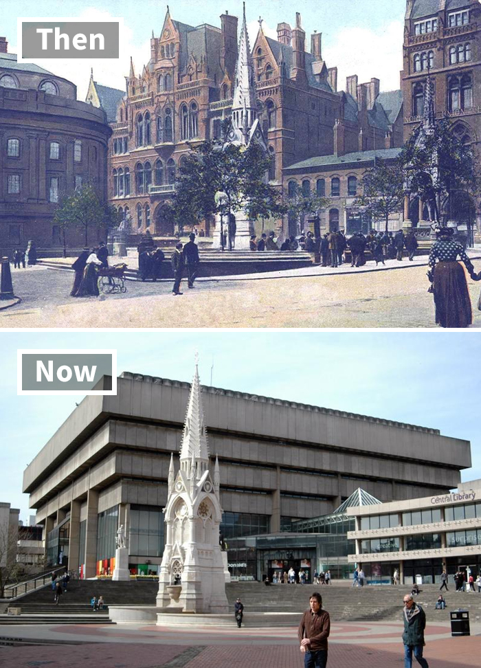
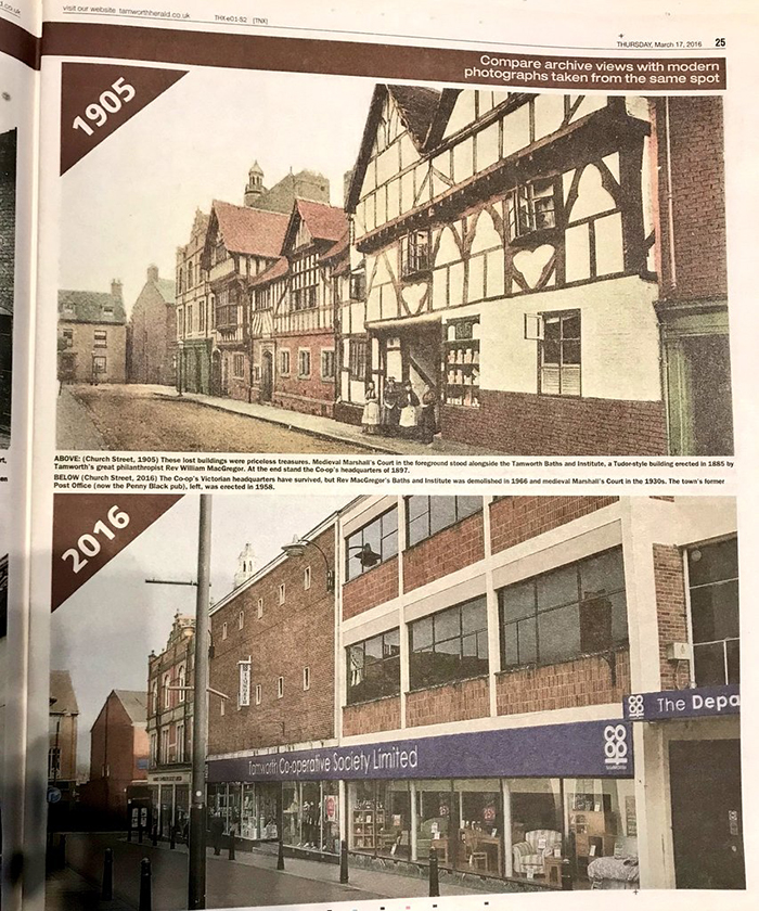
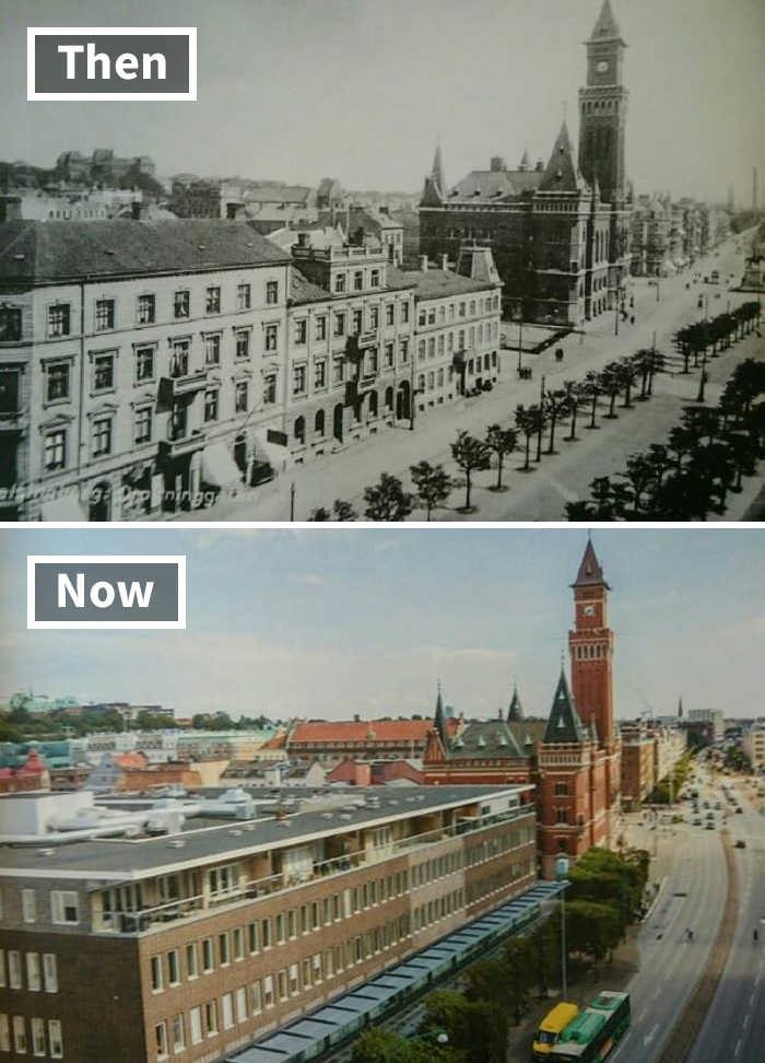
The Birmingham city centre one was done in the 1970s. From the 1950s to the 1980s there was a lot of this in the UK.
Load More Replies...It's also worth remembering that many old buildings have deteriorated to the point where restoration is prohibitively expensive, even if the original was beautiful. They often don't meet modern safety standards, and would require that builders tear them down to bare bones to retrofit them so they are energy efficient and safe.
Photos a century old don't show what state the property was in when it was renovated or replaced. The Regency-era (early 1800s) buildings where the Birmingham City Library (built in the 1950s) had been bombed.
As Tabernus said - the WW2 is responsible for most of this devastations. We must also remember, that a lot of old buildings, especially housing, was not very nice to live in - lack of toilets, dark patios, narrow backstreets, lack of elevators - many of them looked nice but during '50 and '60 they were considered unlivable and obscure. This is why they were demolished and replaced with modernist blocks, even though some of the demolishings were controversial back then. In Poland we have a lot of very modern demolishings (the reason is corrupted governments allowing developers to destroy original urban structure), one of the most known is "renovation" of 14th century Dzialdowo Castle. They put styrofoam on it and then colours. Luckily it was stopped and reversed by the old monuments protection institution. See below: https://lh3.googleusercontent.com/proxy/DR3tIdFbbUWaxCEasghRxhjHn1kgQXRn654uPjS1ogq2k79wbT9TyPuCJ9Vw6pXt5TIxY4_pjTyvr-SSsw
Now now. I'm sure if the author actually knew what renovation means, they would have chosen differently. But it is so hard to learn new vocabulary.
In addition to the point several other comments made, I think a lot of these were gradual changes, as well. It wasn't like overnight they went from a beautiful gothic building to some ugly modern cookie-cutter design. Not to mention that at the time when many of them were built, that style was very common, and probably wasn't thought of as anything outrageously special, so when updates needed to be made, little thought was given to keeping the style of the previous build, which was probably thought to be outdated at the time of the renovation.
For a contributor that studied English linguistics their understanding of the word "Renovated" leave a lot to be desired.
Sometimes this happens in reverse. The Chronicle Building in San Francisco (built in the 1890's), was damaged in the 1906 earthquake & rebuilt by 1915 (very close to it's 1890's appearance). It was modernized in 1962 with an aluminum & glass exterior, and then restored back to it's 1915 appearance in 2014.
This happens all over especially as real estate/rental costs increase. It is mostly not due to war damage or the inability to renovate. Often the facades of the 'new' buildings are put on top of, next to and over the old building in order to increase the space and, therefore, the $$$ made off each site. Several that I am very familiar with were supposed to be heritage sites - before someone with money and connections came in and snatched the property up.
Some people wouldn’t recognise beautiful architecture if it fell on them or the skill and craftsmanship it took to create it.
It's not renovating if you replace old with new. Renovating means keeping at least some part of the old.
I loved the old buildings! Idk why anyone would want to get rid of them but it would probably be because to make more stuff :(
Most of the time they are in disrepair to the point of dangerous.
Load More Replies...I just quit looking. The new designs were just so unattractive, ugly and truthfully just plain disrespectful!
Unanimously, ALL the Thens are far superior to the Nows. So sad to lose all that historic beauty.
or maybe a bomb distroyed the building in the war...
Load More Replies...This is a pretty lazy list - many of the original buildings were either bombed or cleared after WW2. In many instances the replacement buildings were put up quickly and cheaply, or were genuinely believed to be cutting edge in the '60's
Thank you for clarifying that. Usually in architecture you can see bones and remnants left from the original, but many of these were clearly different.
Load More Replies...I imagine that so many of the before buildings were in such bad condition that it was less expensive and safer to tear them down.
Every photo that shows a building destroyed in WW2 and what replaced it needs to be removed. Comparing what became a bombed out pile of rubble to a new building is bullshit.
If we were misled on even one of the photos it negates the entire premise of the post. Replaced is not renovated and if a major portion of the original building was destroyed and replaced with something else entirely that does not qualify as a renovation either.
Load More Replies...Many of these are not renovations but replacements. This "list" is no list. Totally useless.
The title of this post is so misleading 😠 Those are NOT renovations! Most of the pictures show what was in that spot decades ago and then what's there now. Given most of those are from Europe it's safe to say that "before" buildings no longer exist because of the bombings in WW2 or were torn down not much later due to damages.
A lot of the time, this is done because there's really no other choice. An old building is falling apart and otherwise unsafe/unusable as is. We don't t know the full stories, here. That said, turning something charming and comfortable into something Brutalist or Minimalist isn't usually a good idea. Especially when it's a result of gentrification driving out people in favor of new, wealthier, people.
i kinda like Brutalism... its so ugly and weird that its fascinating... its a part of history now, but I dont understand they thought it was a good idea back then.
Load More Replies...Most of these were either damaged or destroyed in WW2, or the original structure was unstable after being abandoned for years. Now, if you want something gross that doesn't come under these conditions - Maidstone Museum, listed old mansion house that they cut a hole in and slapped a burning gold and glass structure on the side of. maidstone-...f1baca.jpg
I don't know any historcial facts or storys behind these bulidings, but people shuld take a look back and appericate the buliding thats aleready there.
A lot of the old buildings got bombed so that's a valid reason to replace them with was considered modern architecture. Sadly even today beautiful buildings get destroyed because a council wants to "step into the future" by building ghastly concrete towers. That's why a lot of cities are so terrible depressing. Grey pavement, grey buildings, black tarmac.
Sad. Before old building look beautiful and interesting. Lazy after new build. I hate new build like modern buildings. I like vintage and cozy old things.
"renovation" is not building from the foundation on the remains of last building but renewing or "making something look new again". Half of those are not "renovations".
Let me just point out that not every building survives hundreds of years intact and very often they need to be demolished, and sometimes it happens that during wars buidings (and not just buildings) are destroyed. In those cases, noone creates an exact replica of something once built, but tries to come up with new modern ideas, not necessarily better of prettier, but that's the way it is.
In Russia this type of architecture is called "Stalinist." The horrific monster buildings he had built in Moscow are called "The Seven Ugly Sisters".
Dumb list. Most of these are re-builds, not "renovations". Two totally different things.
many of these are down to destruction during war...but too many horrible examples of bad taste
The Birmingham city centre one was done in the 1970s. From the 1950s to the 1980s there was a lot of this in the UK.
Load More Replies...It's also worth remembering that many old buildings have deteriorated to the point where restoration is prohibitively expensive, even if the original was beautiful. They often don't meet modern safety standards, and would require that builders tear them down to bare bones to retrofit them so they are energy efficient and safe.
Photos a century old don't show what state the property was in when it was renovated or replaced. The Regency-era (early 1800s) buildings where the Birmingham City Library (built in the 1950s) had been bombed.
As Tabernus said - the WW2 is responsible for most of this devastations. We must also remember, that a lot of old buildings, especially housing, was not very nice to live in - lack of toilets, dark patios, narrow backstreets, lack of elevators - many of them looked nice but during '50 and '60 they were considered unlivable and obscure. This is why they were demolished and replaced with modernist blocks, even though some of the demolishings were controversial back then. In Poland we have a lot of very modern demolishings (the reason is corrupted governments allowing developers to destroy original urban structure), one of the most known is "renovation" of 14th century Dzialdowo Castle. They put styrofoam on it and then colours. Luckily it was stopped and reversed by the old monuments protection institution. See below: https://lh3.googleusercontent.com/proxy/DR3tIdFbbUWaxCEasghRxhjHn1kgQXRn654uPjS1ogq2k79wbT9TyPuCJ9Vw6pXt5TIxY4_pjTyvr-SSsw
Now now. I'm sure if the author actually knew what renovation means, they would have chosen differently. But it is so hard to learn new vocabulary.
In addition to the point several other comments made, I think a lot of these were gradual changes, as well. It wasn't like overnight they went from a beautiful gothic building to some ugly modern cookie-cutter design. Not to mention that at the time when many of them were built, that style was very common, and probably wasn't thought of as anything outrageously special, so when updates needed to be made, little thought was given to keeping the style of the previous build, which was probably thought to be outdated at the time of the renovation.
For a contributor that studied English linguistics their understanding of the word "Renovated" leave a lot to be desired.
Sometimes this happens in reverse. The Chronicle Building in San Francisco (built in the 1890's), was damaged in the 1906 earthquake & rebuilt by 1915 (very close to it's 1890's appearance). It was modernized in 1962 with an aluminum & glass exterior, and then restored back to it's 1915 appearance in 2014.
This happens all over especially as real estate/rental costs increase. It is mostly not due to war damage or the inability to renovate. Often the facades of the 'new' buildings are put on top of, next to and over the old building in order to increase the space and, therefore, the $$$ made off each site. Several that I am very familiar with were supposed to be heritage sites - before someone with money and connections came in and snatched the property up.
Some people wouldn’t recognise beautiful architecture if it fell on them or the skill and craftsmanship it took to create it.
It's not renovating if you replace old with new. Renovating means keeping at least some part of the old.
I loved the old buildings! Idk why anyone would want to get rid of them but it would probably be because to make more stuff :(
Most of the time they are in disrepair to the point of dangerous.
Load More Replies...I just quit looking. The new designs were just so unattractive, ugly and truthfully just plain disrespectful!
Unanimously, ALL the Thens are far superior to the Nows. So sad to lose all that historic beauty.
or maybe a bomb distroyed the building in the war...
Load More Replies...