Graphic symbols and elements we see in famous logos today are a result of numerous techniques studied in the last couple of centuries. Considering the evolution of our society and its demands the old Instagram logo, introduced in 2010, might just not cut it today. The original Apple logo with its realistic style drawing looks way too complicated and forgettable for us, while the old Starbucks logo shows some indecency in it. We, as a society, are more used to simplistic style these days. Also, since we've gotten better at understanding symbols, famous logos changed taking in mind our demands.
Take a look at this list compiled by Bored Panda for example. In it, you'll find some of the world's most famous logos, both how they look now and how they looked in the beginning. While you probably recognize all of the contemporary ones, many of their original counterparts aren't so easy to identify.
This post may include affiliate links.
Bored Panda

Apple
Mozilla Firefox
Starbucks
Walt Disney
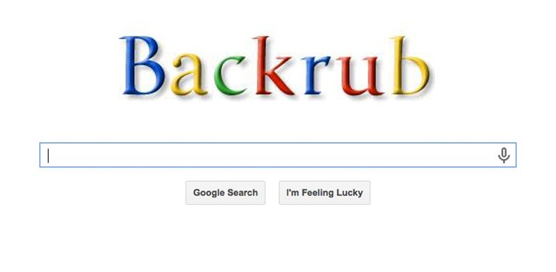
The original name was BackRub before changing to Google 2919154800...0bad02.jpg 
I actually thought these were 'fake', some kind of joke - until I saw the Google one and remembered that it did really look like that. :-D
The colors on the first one are wrong the colours were never switched. PS: You need an exlamation mark for the first one. PPS: The reson why the (e) in "Google!" has never had a perfect alignment is because the're trying to tell you that the're not perfect, or atleast from what I've heard.
i remeber when i was 3 or 4 i would go on my moms lapot and i would always see this untill i turned 7 it was difrent i was so confuzzled
the oringinal name is Back-rub changes name to Google Backrub-5b...80e83e.jpg 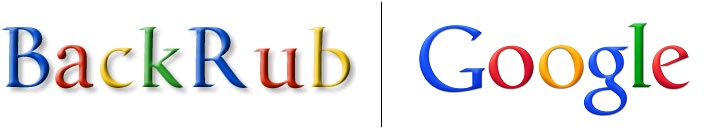
It's all about the way the mind perceives colors. Too much of one color can cause specific feelings for people, and blue has been proven to
I hate the sans-serif font and monochromatic coloring of the current logo.
Nokia
Canon
So Canon started out as Kwanon, Guan Yin, what Westerners call the Buddhist goddess of mercy. Only Guan Yin is asexual, and not a god.
Amazon
Realised that the new Amazon symbol buys you stuff A-Z looking at where the arrow is going
Nintendo
Volkswagen
Coca Cola
Snapchat
Playboy
I remember back in the day when girls would tan, everyone had those little bunny stickers they would put on before they laid out, and would flaunt their little tan tattoo lol Anyone else remember that?
Kentucky Fried Chicken
Discovery Channel
So discovery channel started back when people still believed in a flat earth!
Burger King
Adidas
Shell
Ikea
Nestle
Mcdonald's
Pepsi
Is it me or the first pepsi logo is simmilar to the current coca-cola?
At&t
I don't know why it never occurred to me that AT&T was short for anything.
Fedex
Ge Healthcare


Heineken
Mazda
Visa
Adobe Systems
Probably just used Photoshop to make the first one because they thought indesign was too expensive for just one logo.
Pampers
Nissan
Lay's
Microsoft
Eskimo
Kodak


Samsung
Audi
British Airways
British airways was called - British Overseas Airways Corporation (BOAC) and had a completely different logo. check out british airways homepage they have some cool fotos from the early days.
Dell
Procter And Gamble
Walmart
I thought it was Kurt Vonnegut's a*****e painting.... 99d5ec6e3b...526d61.jpg 
Xerox


Would be interesting to see some of the logos in between the first and current. Like Apple, for instance, with their multi colored apple from the early 90's.
That's what I was told when I drew the Mastercard Logo years ago
Load More Replies...Do you think if some color was added to SOME of the old logos they would look better?
Load More Replies...Half of these logos are made up. The Coca-Cola advert definitely was always in the distinctive script. The website even tells their story!
Nissan and Lay's seem to have gone backwards in time. Their initial logos are so in tune with today!
