60Kviews
Graphic Designer Creates Clever Typographies That Show “The True Meaning” Of Words
Mindaugas Dudenas is a freelance graphic designer from Lithuania known for his clean, minimalist works, and this series is not an exception. Called “Type in Motion”, it explores the meanings behind words in clever typography animations.
“I created the first artwork completely by accident,” Dudenas told Bored Panda. “One day I was just thinking about the concept of time and how people perceive it, and the visual idea just popped up. I didn’t expect it to grow into a series at first, but after sharing the first animation, I received lots of positive responses that inspired me to challenge myself and express my ideas through animated typography.”
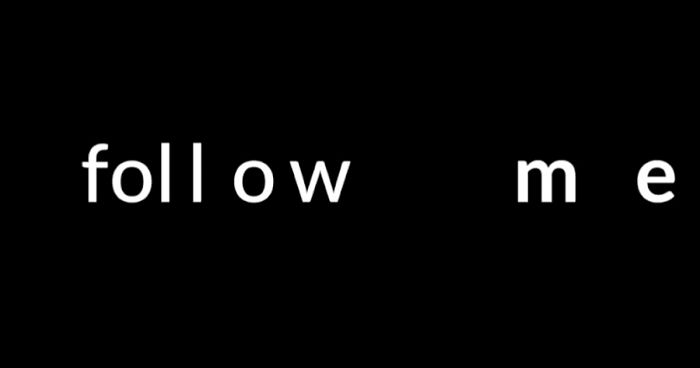
Dudenas illustrates simple everyday words, turning them into visual representations of their own identity. He takes a familiar part of the meaning we all have in our heads and adds it to the actual word, for example, "i" in “time” becomes “t:me”, we can also see “oo” opening in “doors”, and “il” transforming into a smiling face in “smile”.
The ideas come to his head in different ways. “Sometimes I have those words that might be turned into something written somewhere. In this case, they lie somewhere deep in my head and after some time the idea just comes to me without a lot of thinking, so I just have to realize it,” says Dudenas. “There were moments when everything seemed so clear and I knew exactly what I had to do. But there were also days when I’ve been spending hours thinking about it and at the end leaving it for the next day, without any results.”
Designer has always admired minimalism and the possibility to portray complex ideas through simplicity. “When I create, I try to think how other people will see my work and how much it will influence others. Lately, I’ve been concentrating on effectiveness and learning not to be afraid to fail and take risks, to make my decisions faster and understand that all the work I do at this moment is not the final definition about me as a creator. That all this is a process, and the results will only be visible in the future.”
More info: behance.com
This post may include affiliate links.


Oh, wow, btw! In Croatian, laughter is "smijeh" and smile is "osmijeh". Never thought about its connections with english "smile". Until I saw your comment (and this picture).
Load More Replies...

Could someone help me understand this one? I know it says Summer, but what it's doing doesn't seem to have anything to do with anything (that I can think of...)

But wind isn't linear...? More like sliding side to side. Great job though for the idea...

First like before this gets on trending. Seriously though these animations are so simple but so cute. Good job and keep up the good work!
The most ingenious ideas often look so simple and logical that I always wonder why nobody has come up with them before :D
The current top 9 are good but then they descend into obscure ideas that try too hard to work.
