956Kviews
50 Times People Encountered Such Bad Designs, They Just Had To Share (New Pics)
Designing a product, ad, or building is far more difficult of a challenge than you might think. Sure, you could argue that human beings are instinctively artistic and love aesthetics, but the sad truth is that there are far (far!) too many design fails out there. I’m not going to lie, sometimes they keep me awake at night. Thinking about them is both hilarious and terrifying at the same time. And the most powerful pics tend to haunt you for weeks and sometimes months at a time. Good design, why are you so rare?
One of the best places to find some outstanding examples of double-plus-ungood designs is this subreddit right here which shames and pokes fun at them for our amusement. Have a look through some of the best (worst?) design disasters that they featured recently. Remember to upvote the ones that you loved to hate the most and I’d absolutely love to hear which of these were your (least) favorite!
Pssst, Pandas, we know how much you love looking at epic design fails and aesthetic apocalypses, so we cordially invite you to check out Bored Panda’s earlier posts about them after you’re done enjoying and criticizing this list. You’ll find the articles here, here, and here.
This post may include affiliate links.
Gas Station In Nebraska. The Station's Color Scheme Was Red. They Tried To Get Artsy


The New School In My Community Has A Wheel Chair Access Button For The Door, But No Way For A Person In A Wheel Chair To Reach It

Inaccessible design is so common and it wouldn't take much thought to change it
Lex? Derp? Lox? Nope, It's Supposed To Say Jax For Jacksonville, Florida For $18 Million Dollars

The subreddit that makes fun of bad designs is a goliath on Reddit with a whopping 2.6 million members. The online group has been active since January 2011 and has become a true pillar of design discussion online, ranging from the silly and fun to the in-depth and serious.
Over the last two years alone, the subreddit grew by nearly a million members from 1.7 million adoring fans. Back then, they were getting 2 million page views per month. That’s proof enough of their popularity.
Great Image To Help Your Kid Not Freak Out While Getting A Haircut

Women's Jeans, I Want The Rest Of My Pocket

Striped Carpet On Hotel Stairs. Hard To Use Even After Two Weeks And Completly Sober

I previously spoke to a member of the subreddit’s moderator team to learn a bit more about their community. One of the mods told me previously that the “original motivation” of the subreddit was to “point out” horrible designs.
“Nowadays, most subscribers probably come here for entertainment. However, it is common to have meaningful discussion here on why or why not something is [bad] design,” the mod told Bored Panda.
The Placement Of This Baby's Head Wasn't Quite Thought Through

Best Cat Carrier To Contain Your Sexy Cat

Not Where Earphones Go

We might intuitively understand what good design is, however, it’s a real challenge to get the design just right. It’s not just about beauty or function, however (though these are vital, too!). The idea of good design goes deeper still.
For instance, researcher Don Norman believes that the essence of design is… communication. “Design is really an act of communication, which means having a deep understanding of the person with whom the designer is communicating,” he writes in ‘The Design of Everyday Things.’
Pet Clippers That Let You Pull Naked Dogs Out Of Furry Behinds

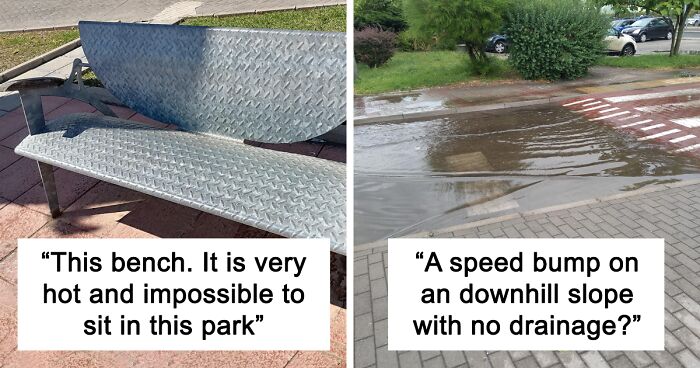
This Bench. Where I Live It Is Very Hot And It Is Impossible To Sit In This Park

But you can use it to fry eggs and grill some steak. Perfect for a picnic in the park.
Why Is Clear A Green Button While Enter Is Yellow? I Kept Accidentally Clearing My Pin

According to Norman, design doesn’t have to be complicated. He argues that usability is just as important as aesthetics. Or, in other words, the product has to be functional and useful, not just a pretty thing to look at.
Norman explains that product design cannot ignore the needs of users. In the book, he argues that good, usable design is entirely possible, not just a dream conjured up by idealists.
“The rules are simple: make things visible, exploit natural relationships that couple function and control, and make intelligent use of constraints. The goal: guide the user effortlessly to the right action on the right control at the right time,” he writes that some products are able to satisfy customers’ needs while others only end up frustrating them.
This Sign At The Akron Zoo That Looks Like A Man Peeing In His Own Face

Rénovations Done To A 500 Years Old Tower

Seen this one before. This is the only design the council approved after years of fighting and rejecting many much more sympathetic ideas. It's an episode of George Clarke's Restoration Man
Well it was in Scotland after all. We have very incompetent councils up here.
Load More Replies...I watched this episode of Restorationan. It was the only design which I absolutely hated. It was such a pity the original design was stopped but it was a big mistake to paint it blue.
Maybe they painted it blue to highlight the glaring stupidity of the council.
Load More Replies...This is horrible. A travesty. Get your axes is right except get them for council members
WHY?! This is incredibly ugly and tacky. It made the tower look really crappy :-(
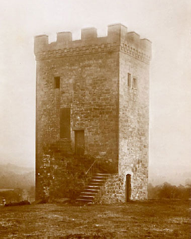
Didn't know that Dutch councils have such an international influence on architecture.
This is 100% down to the ree d**k you louse planning laws currently in place in the UK.
Preservation groups are a nightmare. I used to work in a pub that was built in the 16th century. When we wanted to convert an old store room into more seating, we had to make it obvious which parts weren't original. Think fake wooden ceiling beams made from shiny brown plastic, instead of rough cut wooden beams like the rest of the pub. Then when a car crashed into the building and took out the wall, they made us re-use the original materials, including the bricks that were little more than dust, and the wood that we discovered was rotted

Seems wrong in so many ways. The result of practicality, a legalize. The result, your head is up ur ass….
Sticks out like a sore thumb! Something better could have been erected that fit in with the theme.
It looks absolutely awful the one who passed this needs to get another job
NO! They should be put in …that medieval wodden thingie, that fixates your head and to arms in a board, so you csn get egged, tomatoed and spat on by passing brats.
The ugliness literally takes your breath away. Like a blue cancer eating its way up an ancient structure.
Wow , they really stayed with that centuries old aesthetic.... , er nah ?
What makes this even worse is, now that it's too late to do it right, they can't even just paint the (awful) new section a nice earthy gray to kinda, sorta go with the original? That's just perverse.
I’m expecting Gene Kelly to come dancing down those steps any minute.
**** why not just sell the **** thing and buy the place you want with the money. Did they have to bring all the wiring up to code in the whole building or just in the new wing?
They Just Don't Go Together

The concept of jigsaw puzzles apparently eluded the designer of this one.
Easy Way To Piss Off A Mailman

"yes, this is the mail man, I'm dropping all your packages in the gas station good luck"
A Speed Bump On An Downhill Slope With No Drainage?

This Is Not Vitamin D; It's An Emoji On A Bottle Of Magnesium

If You Say So!

Her Face Is Not Ok

The Sign Says "Teaching Kids Good Manners", But It Looks Like You're Just Yeeting The Baby Into Trash

Got This As A Gift And Honestly I Don't Want To Throw It Away Just Because It's Terribly Funny

Thought It Was A Different Language At First

It's a feature of Microsoft Word. Obviously. Let me elaborate: https://i.kym-cdn.co...809/345/144.jpg
This Unfortunate Placement Of A Handle

The Marbling In These Floor Tiles Makes It Look Like Someone Pooped All Over The Floor

Sure, Place An Ad With A Guy Drinking Water Next To Rubbing Alcohol Of The Same Brand


They Sell Suitcase Covers.. But The Photoshop Is Just Awful

Maybe I Shouldn't Park Here

Much More Convenient!

Is This Andre The Giant’s Treadmill?

Practical Bathroom

So the sink is downstairs? the bath in some sort of weird glass upstairs nook and the toilet in the cubby beneath? Wow
How On Earth Can The Overpass Be Flooded?!

Restaurant Bathroom: One Mirror Panel On Top, One On The Bottom...no Way To See Myself In Between

This Amazon Photo Where The Kids Don't Even Look At The Toys

Welcome Shorpers

Pirate shopping center. Arrrgh, shorpers, ye come in and purcharse something, ay.
Don’t Have Hep C? Get Some!


This Frozen 2 Temporary Tattoo Is Supposed To Say "Face Your Fear", But The First Two Words Are Written In An Orange-Ish Color

This Shirt That Looks Like It’s Covered In Coffee Stains

Oh this is perfect excuse shirt for Monday mornings when you drop coffee hastily
He's Either Sucking On Her Head, Or He Is A Raccoon Cap... Not Sure Which Disturbs Anymore

The Balcony Of My Hotel In Switzerland Is Only Accessible Through The Window

This Tea Will Change Your Image Size Ratio!

The Design Of This Pillowcase Makes It Look Like There Are Bugs Crawling On It

This Hose Cart Creates Water From Thin Air

Nev York

Outdoor Tables With Rough Surfaces

The Shower In My Dorm Freshman Year (I'm Only 5'7)
")


Hedge Archway In The Neighborhood

A Very Easy To Read Graph About Texting While Driving? Found In My High School Yearbook

Is This Cake Like Deadpool?

In A Friend's Wedding Goodie Bag

Note: this post originally had 79 images. It’s been shortened to the top 50 images based on user votes.


Damnit I came here too late y'all stole the good comments before I could
Not sure exactly what Walmart was trying to accomplish with this 2017 display of emoji-themed adhesive bandages... Rainbow-Po...91a4dd.jpg 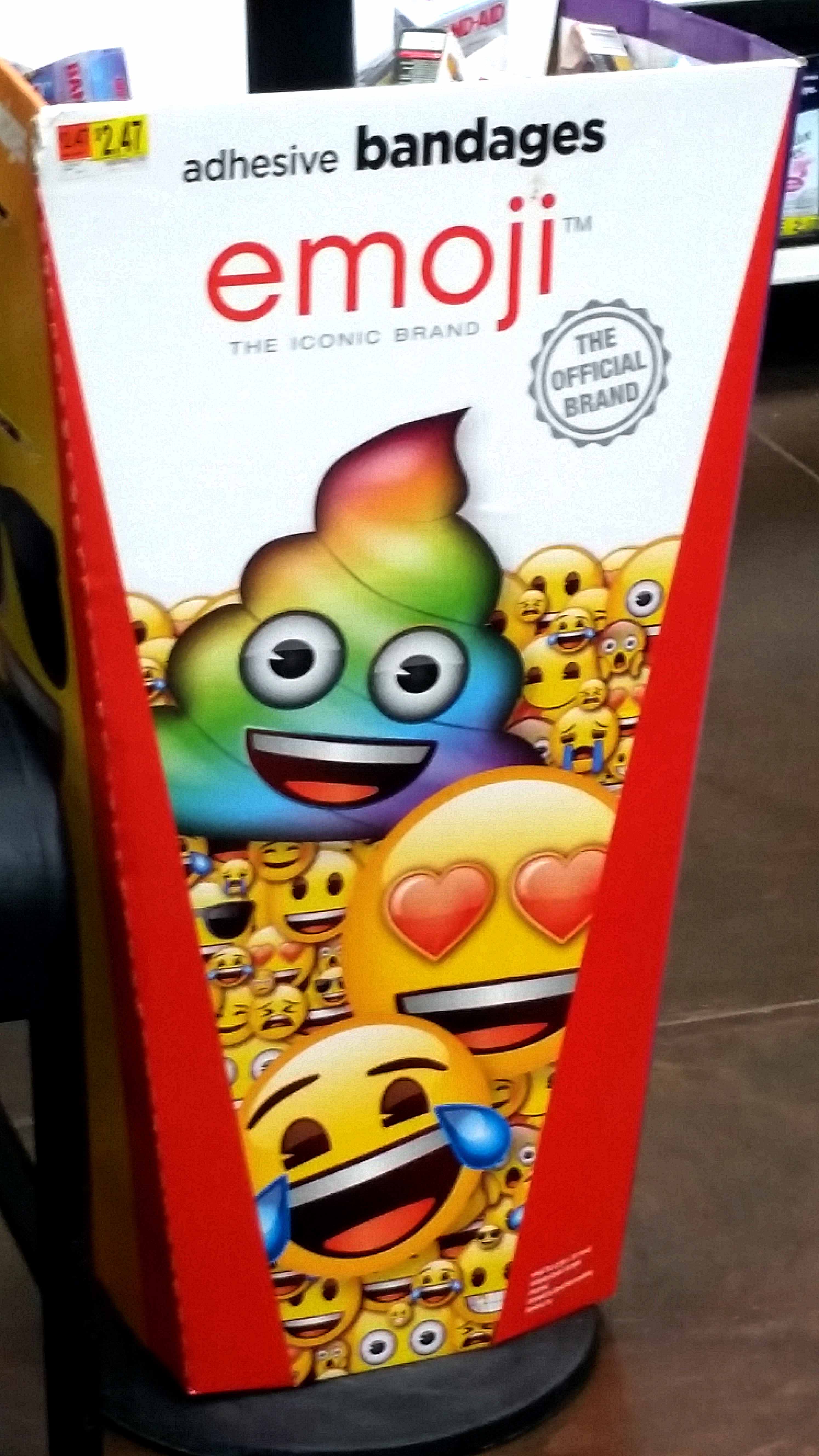
Damnit I came here too late y'all stole the good comments before I could
Not sure exactly what Walmart was trying to accomplish with this 2017 display of emoji-themed adhesive bandages... Rainbow-Po...91a4dd.jpg
